Uber Eats is a food-delivery subsidiary of UberTaxi company, which was created in 2014 in the USA and today operates in almost twenty countries across the globe.
Meaning and history

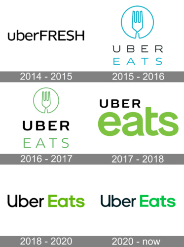
The food delivery service was introduced by Uber in 2015, but it has already changed its visual identity design four times by now, which is pretty impressive for such a young brand. Though the color palette was chosen in 2016, the company was still staying to find its perfect style, which would represent it at its best.
2014 – 2015
The very first logo of the Uber Eats service featured the original name of the application, Uber Fresh. It was a very minimalistic and progressive badge, with just the lettering in bold black lines set against a plain white background. The inscription was visually divided into two parts: the “Uber” in lowercase, and the “Fresh” in all-caps, with no extra space between the words. The wordmark was set in a full-shaped rounded font, which looked friendly and fresh.
2015 — 2016
Uber Eats was introduced as Uber Fresh in 2014, but in a few months the name of the service was changed and the first logo was created. It was a two-leveled inscription in the custom Uber typeface with the upper, “Uber” part in black, and the bottom “Eats” in light blue. The circular emblem with a fork was placed above the lettering, executed in the same light blue and white color palette, as the “Eats” part.
2016 — 2017

The typeface and the color palette of the logo were changed in 2016. The light blue shade was replaced by a grass-green one, the emblem became a bit smaller, while the wordmark got enlarged. The “Uber” part of the nameplate was executed in a new corporate sans-serif, with bold lines, and the “Eats” featured a more lightweight and simple font.
2017 — 2018

The redesign of 2017 completely changed the concept of the Uber Eats visual identity: the emblem was removed and now the “Eats” part of the wordmark became a star of the logo. Its enlarged green lowercase letters were placed under the black “Uber” executed in its corporate font.
2018 — 2020
In 2018 the logo was redrawn again, placing both parts of the nameplate in one horizontal line. The “Uber” was written in a light black title case, while the green “Eats” used a heavier font for its letters. The color palette was the same as in the previous version, just the green became one shade darker.
2020 — Today
The redesign of 2020 renews the Uber Eats emblem color palette, making the green brighter and lighter, replacing the black with dark gray. As for the typeface of the nameplate century, it remained untouched.
Font and Color
The logo of Uber Eats uses two different typefaces for its two parts. The black “Uber” is executed in the custom font, created for the company and called Uber Move, which is pretty similar to such fonts as Yaro St Regular and Kaleko 205 Medium, but with some lines modified. As for the bolder “Eats” inscription, it uses a different typeface, the one, that is closer to Okta Neue Semi Bold and Galano Grotesque Semi Bold Fonts.
The green and black color palette, which the service chose in 2016, got slightly modified throughout the years, and the current version reflects the growth and movement of the company, evoking a sense of success, progress, and energy.


