Wikipedia is a free online encyclopedia, which explains almost every subject. Information is available in a variety of languages.
Meaning and history
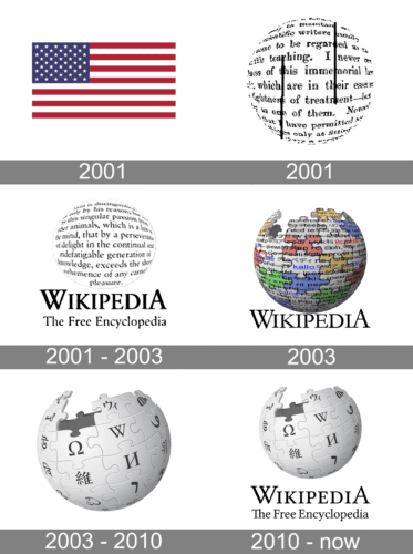
Wikipedia did not exist until 2000 when Jimmy Wales and Larry Sanger conceived the idea of creating a universal source of information on the World Wide Web. This was the creation of addition for Nupedia, a popular science resource at the time.
Unlike Wikipedia, the articles here were written and edited by professional scientists. During the three years of its existence, this encyclopedia had 25 completed articles and another 74 articles that were in the process of improvement and review. Despite this, in 2008 CNET Networks named Nupedia as one of the greatest now-defunct sites in history.
The technology of user-editing (wiki) sites predates the creation of Wikipedia. The term wiki was first used to describe a website in 1995 by Ward G. Cunningham, the developer of the first wiki system, WikiWikiWeb. For the name, he borrowed a word from the Hawaiian language meaning “fast”.
What is Wikipedia?
Wikipedia is the name of the world’s largest and most popular online encyclopedia, which was deep-oiled in the United States in 2000, and launched in 2001. Today more than 30 million articles on Wikipedia are translated into languages bet 130 languages (This includes both official languages and various dialects).
2001 beta
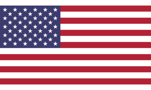
For the logo of the beta version of the world’s most famous online encyclopedia, the platform’s founders decided to use the most patriotic symbol — the national flag of the United States. Even though it lasted for just a few months, looking at the logo timeline of Wikipedia today, this one is the first to notice. The flag was drawn in a minimalistic distinctive way with red stripes and black rectangles set on a white background, with no framing.
2001
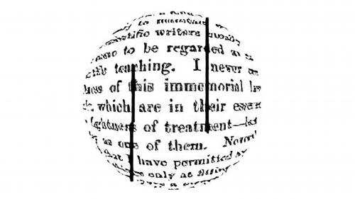
The core visual metaphor has remained unchanged in spite of all the modifications the logo has gone through over its history.
The earliest Wikipedia logo was already based on the circle, which was of course inspired by the shape of our planet. Also, there already were letters written inside the circle. Back then, the letters were small and formed multiple words, which is very different from the current design.
2001 — 2003
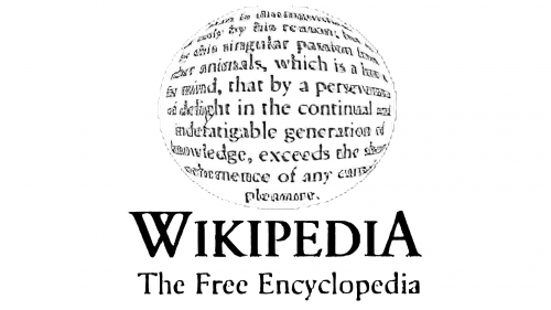
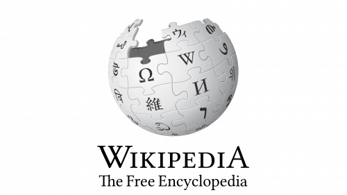
The globe could be paired with the large word “Wikipedia” and the lettering “The Free Encyclopedia” in smaller letters below.
2003
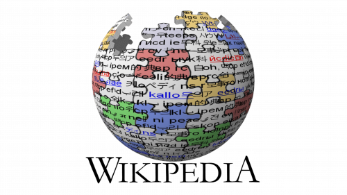
This version was designed by Paul Stansifer and later modified by David Friedland. The logo was an incomplete globe constructed of jigsaw pieces with a few ones missing at the top. Previously, there was some multilingual text inscribed on each piece, which was later replaced with glyphs. That shape was in use until 2010.
2003 — 2010
The globe was slightly rotated reminding the position of the Earth. In this version, the words on the jigsaw pieces were already replaced by separate large glyphs.
2010 — Today
The current Wikipedia logo is the same unfinished jigsaw globe with thinner boundaries between pieces, which give it a sleeker appearance. There were erroneous glyphs in the previous version, and they had to be (and were) replaced with correct ones. A wordmark ‘Wikipedia’ is placed beneath the globe, and ‘The Free Encyclopedia’ slogan underlines the whole emblem.
Symbol
The Wikipedia logo symbol was meant to reflect the company’s never-flagging (and, based on the goal, never-ending) striving to embrace the world and cover all possible subjects. The missing jigsaw pieces stand for the impossibility of this mission of seizing the unseizable. The glyphs symbolize the website’s multilingualism.
Font
The Wikipedia logo uses a stylish serif font.
Color
The color palette used in the Wikipedia logo consists of light shades of gray.


