 Wichita State Shockers Logo PNG
To understand the Wichita State Shockers logo (which is utterly unique, by the way), one needs to know the story of the nickname.
Meaning and history
 The word “shocker” means a person who harvests wheat (the verb “shocked” is used with the same meaning as “harvest”). Back in the beginning of the 20th century, many players “shocked” wheat to earn money during the summer holidays. So, a football manager invented this nickname in 1904 to refer to this activity.
1948 – 1959
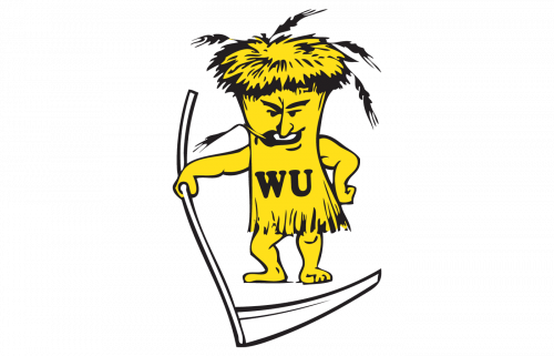
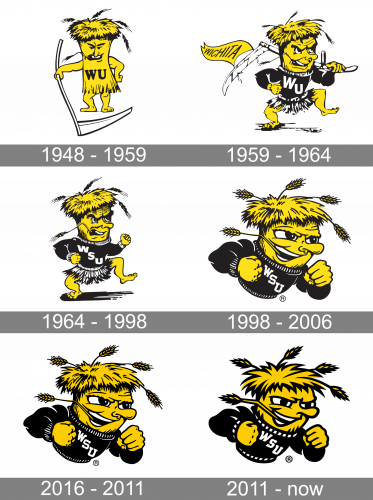
The Wichita State Shockers logo, designed in 1948, stayed with the program for almost a decade. It was a funny caricature of a yellow creature with a human body and head but drawn straight, like a tree trunk, and with his hair stylized as a harvested wheat. The man was all yellow, with his long jersey having a bold black “WU” on it. In the left hand of the creature, there was a long white scythe.
1959 – 1964
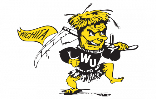
The redesign of the Wichita State Shockers badge, held in 1959, has redrawn the shocker from the previous version, and now he was El wearing a black and white long-sleeve jersey with the white “WU” lettering. Apart from a scythe, the creature was holding a yellow banner, weaving behind his back. The narrow banner had a black uppercase “Wichita” lettering written across it in the modern medium-weight sans-serif font.
1964 – 1998
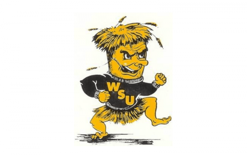 The “shocker” has been depicted in a variety of ways. In 1972-1991, for instance, he was featured in full height.
1998 – 2006
The Wichita State Shockers badge was redesigned again in 1998, and now just the upper part of the shocker’s body was drawn on it. All the additional elements and lettering were removed, and now just the determined man in a black jersey withwhite lettering on it was depicted on the logo. He looked strong, determined, and ready to fight.
2006 – 2011
The badge, used by the athletic program at Wichita State University from 2006-2011 was pretty much the same as the previous version of the badge, but with the colors slightly deepened and getting more intense, and the overall mood getting more confident and aggressive. All the elements remained in their places, but the darker yellow made its job perfectly.
2011 – Today
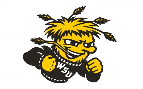
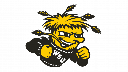
The Wichita State Shockers logo was refined and strengthened in 2011. The concept and color palette of the logo remained unchanged, but the contours were cleaned and outlines — emboldened. All the elements of the logo were refreshed and drawn in a more modern way, reflecting the progressive mood and professionalism of the club. Less small details and more character, this is what the redesign of 2010 was about.
What are Wichita State Shockers?
Wichita State Shockers is the name of the athletic team from the Wichita State University, which is situated in Kansas, USA. The clubs represent six main men’s sports divisions, and seven — women’s.
Wichita State Shockers Colors
WICHITA STATE YELLOW
PANTONE: PMS 116 C
HEX COLOR: #FFCD00;
RGB: (255, 205, 0)
CMYK: (0, 16, 100, 0)
WICHITA STATE BLACK
PANTONE: PMS BLACK 6 C
HEX COLOR: #000000;
RGB: (0,0,0)
CMYK: (0,0,0,100)


