Theranos was a health technology corporation based in Palo Alto, California, United States. The company was shut down and liquidated, while the founder was indicted for wire fraud and conspiracy.
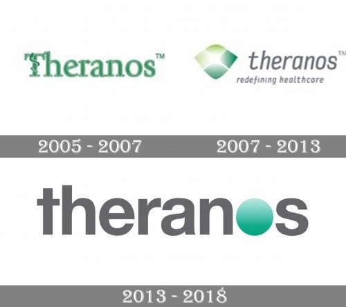
While the original Theranos logo was based on traditional medical symbolism, the following version emphasized the “technology” part.
Meaning and history
The company was established in 2003 by Elizabeth Holmes, a 19-year-old Stanford dropout. The name was made up of parts of the words “therapy” and “diagnosis.”
The firm was hyped to its investors and in mass media as a breakthrough in blood-testing. The founder made people believe that she possessed a unique technology of blood tests where only tiny amounts of blood were necessary (only 1/100 to 1/1,000 of the amount required for a typical test).
The company was evaluated at $10 billion in 2013-2014, at its highest point. However, the “breakthrough technology” was proved to be false, and in 2018, Theranos ceased operations.
2005
The company introduced a logo in green featuring a snake. The creature was crawling along with the letter “T” as if it was a pole or a tree.
The snake has been the symbol of the medical profession since ancient times. Researches have mentioned at least three important reasons for this.
First, there is a legend telling that in 1400 BC, Moses used the bronze serpent on a pole to cure people bitten by snakes. Also, the fact that the creatures shed their skin has been referred to as a symbol of longevity and even immortality. In addition to it, the snake can transfer from lethargy to rapid activity, which, in the world of humans, has been considered a symbol of the power to convalesce from an illness.
The Theranos logo is based on the so-called Rod of Asclepius, which is a pole with a single snake. The creature is the centerpiece of the design – the typeface has been chosen to echo its subtle curves. Not only the shape of the letters reminds the snake’s body. The green color is the natural color of many snakes (in addition to being the color most associated with medicine). Also, the letters feature white highlights similar to those snakes have on their glittery skin.
2007
This time, the medical allusions were replaced by a “tech” logo. Instead of the curvy shapes, serifs, and elegant variations in the width of the strokes, comes a sleek type. The letters are lowercase and don’t have serifs. They are italicized, which adds a dynamic touch.
The “snake” theme is still present in a subliminal way. If you take a look at the shield, you will notice it reminds of the snake’s scales. At the same time, we have an added meaning of protection as the shield has been a long-standing symbol of power and protection.
The green color of the shield was inspired by the previous wordmark, and also was used to convey the message of “natural” and “trust.”
2013
The “tech” part has been emphasized even more, while the “medical” part has been reduced.
Apart from the green color of one of the elements, nothing reminds the previous Theranos logo. While the letters still belong to a simple sans serif type, they are different. They are straight, wider, with rectangle ends. In the case of the “t” and “a” the difference is especially visible. The “O” is but a large green circle with a gradient.
On the whole, the design has grown cleaner and more minimalistic but it has also lost some of its meaning.
Font
The typography has changed dramatically over the logo’s history, from the classic and elegant serif type of the original marque to the modern sans of the latest one.
Colors
While green, as the color symbolizing nature and medicine, has been present in all the versions, it has grown by far less prominent with time.


