STORM+SHELTER is a content production company specializing in video creation. They collaborate with agencies, brands, and media clients, using their distinctive talent to engage audiences in innovative ways. Their team, a close-knit group of video specialists, is involved in every stage of the content production process, from strategy and concept to delivery. STORM+SHELTER’s work focuses on making audiences feel central to their own stories, producing impactful videos that resonate on a personal level with viewers.
Information regarding the current ownership and primary markets of STORM+SHELTER isn’t readily available. The ownership details and specific market focuses of companies, especially in dynamic industries like content creation and media, can be subject to change and may not always be publicly disclosed or easily accessible.
Meaning and history
STORM+SHELTER’s journey is one of creative evolution and innovation in the dynamic world of content production. Specializing in video creation, this company emerged as a force in the media industry, known for collaborating with agencies, brands, and media clients. The heart of STORM+SHELTER lies in its ability to engage audiences through compelling storytelling, a skill that has defined its trajectory.
The company started as a small ensemble of video specialists, each bringing a unique blend of creativity and technical expertise. Their initial focus was on crafting videos that resonated on a personal level, making viewers feel like the protagonists of their own stories. This approach set them apart in an industry saturated with generic content.
As the digital landscape evolved, so did STORM+SHELTER. They embraced new technologies and trends, adapting their production techniques to stay ahead in the fast-paced world of media. This adaptability allowed them to expand their services beyond traditional video production, venturing into innovative areas like interactive media and digital storytelling.
Collaboration has been a key theme throughout their history. By working closely with clients from various sectors, STORM+SHELTER has gained a reputation for their production expertise and creative instinct. This collaborative spirit extends to their internal team as well, fostering a culture of continuous learning and growth.
Though the specifics of their ownership and production changes over the years aren’t publicly detailed, it’s clear that STORM+SHELTER has navigated these transitions with a focus on maintaining their creative core and client-centric approach. Each phase of their history reflects a commitment to excellence and an eagerness to explore new creative frontiers.
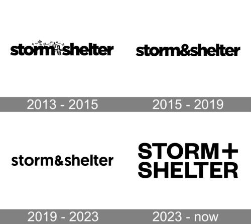
2013 – 2015
The logo presents a bold, modern aesthetic with the company name “storm+shelter” in a sans-serif, black font. The typography is distinctive, with the “+” sign connecting ‘storm’ and ‘shelter’, indicating a fusion or partnership between two forces. The letters are stylized with unique cutouts and breaks, giving the impression of something that has endured turbulence yet stands strong. It’s as if the text has weathered a literal storm, fitting the company’s moniker. The logo’s simplicity is deceiving, as its clever play on typography conveys resilience, creativity, and the idea of protection or refuge – themes that resonate with the brand’s identity.
2015 – 2019
The logo features the name “storm&shelter” in a cohesive, lowercase sans-serif typeface. The “&” sign is neatly nestled between “storm” and “shelter,” symbolizing a bridge or connection between two concepts—perhaps the chaos of a storm and the safety of a shelter. Unlike the previous logo which used a “+” sign, this one opts for a traditional ampersand, signifying inclusivity and unity. The letters are solid and uninterrupted, suggesting stability and reliability. The design is straightforward yet striking, embodying a sense of simplicity and modernity. It stands as a more conventional representation of the brand, focused and clear in its message, contrasting with the previous logo’s more stylized and fragmented appearance.
2019 – 2023
The logo is a minimalist representation with “storm&shelter” in a clean, lowercase sans-serif font. The ampersand is smoothly integrated, suggesting a seamless blend of two elements—perhaps adversity and safety. This design contrasts with a previous version that had a more fragmented appearance, emphasizing the brand’s progression towards a sleeker, more unified presentation. The current logo’s uninterrupted lines convey solidity and simplicity, resonating with modern design trends and reflecting the company’s forward-thinking approach. It stands as an emblem of clarity, stability, and the harmonious balance between the energy of a ‘storm’ and the calm of a ‘shelter.’
2023 – Today
This logo displays “STORM+SHELTER” in bold, uppercase letters, separated by a pronounced plus sign. The typography is assertive, with thick, sturdy characters that convey a sense of resilience and protection—echoing the company’s name. Compared to previous logos, this one employs a more traditional block-style font that suggests strength and stability. The use of the plus sign, rather than an ampersand, might imply a dynamic addition or combination of services or values that the company offers. This design iteration stands out with its commanding presence, offering a straightforward yet powerful visual identity.


