uTorrent is the name of the software, designed for sharing and downloading files. The program was created in 2005 and today it is available in more than 60 languages and almost all the operating systems, including Linux.
Meaning and history
UTorrent is the world’s most famous torrent client. Established in 2005, today this software is synonymous with the torrent itself. But what is a torrent? torrent is a technology for downloading files from the net in parts from different sources.
Any file, be it a game, movie, or program, is made up of parts, or bits. On the Internet, the same file can be on many people’s computers. And if you want to download a movie via torrent, it will be downloaded in parts from different sources, when all the parts are downloaded, they will be put together into one whole file. For the simplification of this process, torrent clients are being designed. And UTorrent is one of those.
What is UTorrent?
UTorrent is one of the most popular online destinations and software for sharing and downloading media files. Designed in the middle of the 2000s, today the software is translated into more than 60 languages and has millions of users from almost every country across the globe.
2005 — 2010

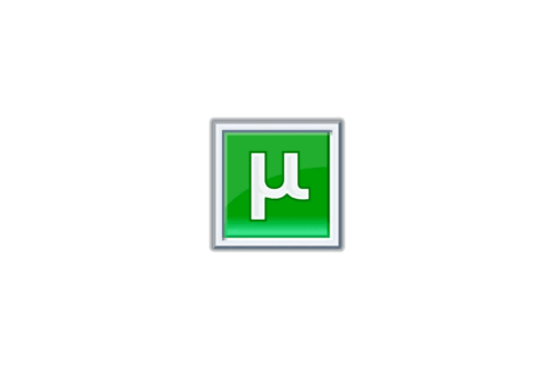
The original uTorrent logo showcased the same stylized “U” as the current one. Yet, back in 2005, it looked somewhat different. The glyph was oriented vertically, not diagonally like in the current emblem. Also, it was positioned inside a bright green box with a silver frame. The box and the frame featured a gradient creating the 3D effect.
2010 — 2013

The design grew simpler. The “U” was slightly rotated counterclockwise. The box disappeared. Now, the glyph could be seen inside a green circle. Both the lower ends of the “U” went beyond the borders of the circle symbolizing the unlimited possibilities provided by the software.
2013 – Today
The uTorrent logo is simple yet instantly recognizable all over the world. Composed of an emblem and a wordmark on its right.
The uTorrent inscription is executed in a bold traditional sans-serif typeface, which looks solid and confident. The first “u” of the wordmark is replaced by the Greek letter μ. This letter is pronounced as “mi” and stands for “micro” in the software’s name.
The uTorrent emblem is a bright green circle with the same “μ” sing in white. Its bold smooth lines perfectly balance the green emblem’s background, creating a kind and friendly sense.
The uTorrent logo is simple yet represents a strong brand with a perfect reputation. The green and white color palette of the uTorrent visual identity is a reflection of growth and progress alongside a loyal and reliable name.
The uTorrent logo is minimalist and timeless, it wasn’t changed much since the very first version and by today became synonymous to the best and most popular file-sharing platform.
Font and Color
The stylish and recognizable UTorrent badge is based on a graphically stylized letter, which has no commercial analogs. The smooth and bold lines of the white element look very modern and friendly, creating a great contrast with the bright green solid circle.
The color palette of the UTorrent visual identity is a representation of energy and motion or a progressive approach to the web portal and its willingness to follow its users’ needs.


