USN, or Ultimate Sports Nutrition, is the company, which was established in 2000 with the idea to provide people who think about heir health with the best quality of supplements and foods for endurance and muscles.
Meaning and history
Ultimate Sports Nutrition is a world-famous company, one of the leaders in the British market of sports nutrition. USN specialists have developed a range of nutritional supplements to help you achieve your goals, both in gaining weight, losing excess weight, or maintaining a healthy lifestyle.
USN Company was founded in 1999 by Albé Geldenhuys, who promised to develop and sell only the most advanced sports nutrition for athletes of any discipline and set different goals.
USN supplements have always been focused on real results without any harm to human health. The company is constantly working on improving and perfecting its sports nutrition formulas. The whole line of USN products is developed based on advanced scientific data under the supervision of highly qualified specialists from Great Britain.
The company’s logo is a symbol of global scientific findings and the latest clinical research that inspires scientists to produce products with the most advanced formulas.
What is USN?
USN is an abbreviation standing for Ultimate Sports Nutrition, a brand of sports nutrition products, established in the United Kingdom in 1999. The company quickly gained popularity thanks to its innovative developments in the field of sports nutrition, and today USN-branded products are available to customers from all over the world.
???? – 2014
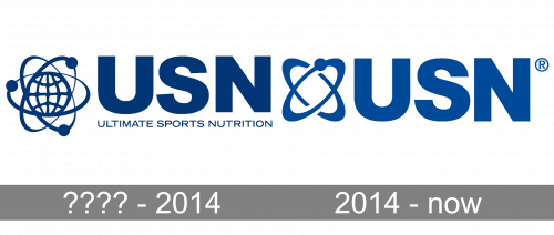
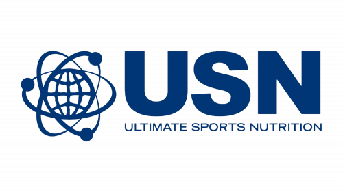
The original USN badge was composed of a graphical emblem, and a two-leveled logotype, set on its right. The emblem depicted a flat contoured image of a globe surrounded by several smooth orbits, representing the international expansion of the company. As for the lettering, it comprised a massive “USN” abbreviation in a laconic modern sans-serif font, and an “Ultimate Sports Nutrition” tagline, executed in the uppercase of a font with wide letters, set in thin lines. All elements of the badge were drawn in a deep shade of blue, which evoked a sense of professionalism and protection.
2014 – Today
The visual identity of the nutritional company is solid and bold, evoking a sense of authority and confidence. Its blue color palette represents professionalism and reli-ability, the two qualities that are very important for any brand in this industry.
The logo is composed of a wordmark with a tagline and an emblem on the left. The abstract circular emblem depicts a globe and several orbits around it, symbolizing the willingness of the company to serve the clients across the world.
As for the logotype part, it is executed in a bold sans-serif typeface, where the en-larged “USN” letters are complemented by a thin and delicate “Ultimate Sports Nu-trition” inscription, also in all-caps, but with thinner lines.
The USN logo is minimalist yet shows the brand at its best and reflects its funda-mental approach and expertise.


