

![]() Univision Logo PNG
Univision Logo PNG
Univision is one of the most iconic telecommunications companies in the United States, originally targeting Hispanic audiences. The company was founded in the middle of the 1950s, and today Univision’s media portals have more than 50 million users.
Meaning and history
![]()
Since the middle of the 2010s, Univision, which had previously focused exclusively on Hispanic audiences, has become a multicultural and bilingual company. Univision’s English-language services include The Onion, a satirical news site; The Root, a site targeting the African-American community; and Flama, a video site targeting young Latinos. 92% of Univision’s audience regularly watches the channel’s live programming.
Also, in 2022, Univision said it will launch a global streaming platform that targets robots in the United States and Latin America. The new streaming service is expected to compete with Netflix for the attention of 600 million Spanish-speaking viewers worldwide. It will combine the PrendeTV, VIX, and Univision Now platforms.
What is Univision?
Univision is the name of the largest Hispanic telecom company in the USA, which was established in 1955 as KWEX-TV, and then renamed into Spanish International Network in 1961. Since the middle of the 1980s the company has been operating as Univision, and today its channels are broadcasting in the USA and Puerto Rico.
In terms of visual identity, for quite a long period of time, Univision was very open to experiments. Considering several of the renames, by 2023 the company’s logo has undergone nine redesigns, with the current style adopted in the 1990s.
1962 – 1970
![]()
After the rename of KWEX-TV into Spanish International Network, the new logo was introduced. The logo was based on quite a minimalistic concept — with the two-leveled uppercase lettering in a narrowed sans-serif typeface. The wordmark was set in black against a white background, with no graphical elements.
1970 – 1987
![]()
The redesign of 1970 used not the full name of the company, but the abbreviation, “SIN”, which sounded pretty controversial to the American audience. The logo featured a heavily stylized monogram in black, with each character formed of geometric elements. The solid rectangular “I” was dividing two more complicated character shapes, adding confidence to the composition.
1986 – 1987
![]()
Another version of the logo was designed in 1986 and only used for several months. It was the first badge with the “Univision” inscription on it. The lettering was written in an art-deco style typeface, under a graphical emblem with the moon enclosed into a rectangular frame. All elements of the badge were set in gradient black and gray shades.
1987
![]()
One more attempt at creating a perfect Univision badge happened in 1987, but the resulting logo was only used for less than a year. The moon was now hidden behind a black horizontal bar, with a rounded bottom edge, and placed on the left from the bold uppercase lettering with a delicate tagline. The font, used for the inscription was stylish and stable, with straight cuts of the bars, and slightly narrowed characters.
1987 – 1989
![]()
The second logo, designed in 1987, has stayed with the company for a little bit longer. It was a badge, consisting of the same two elements, as the previous one, but in a slightly different composition and color palette. The emblem was enlarged and moved above the inscription. The graphical part of the logo was now set in blue and white, while the lettering part turned gold, and became three-dimensional.
1989
![]()
The three-dimensional design was also used for the Univision logo from 1989. It was a golden serif lettering, set in a triangular pattern, with the peak facing the front. The sides of the uppercase characters featured silverfish shades, which created an even fancier and more glossy look to the logo.
1990 – 2012
![]()
In 1990 the designers finally found a perfect badge for the telecommunication company. The style was completely changed. Now the colorful emblem, set above the black narrowed inscription, boasted the shape of a crest, formed by four segments in different colors, with the top left fragment smoothly cut, resembling a petal. The wordmark looked very stable and strict, balancing the brightness of the graphical part.
2012 – 2019
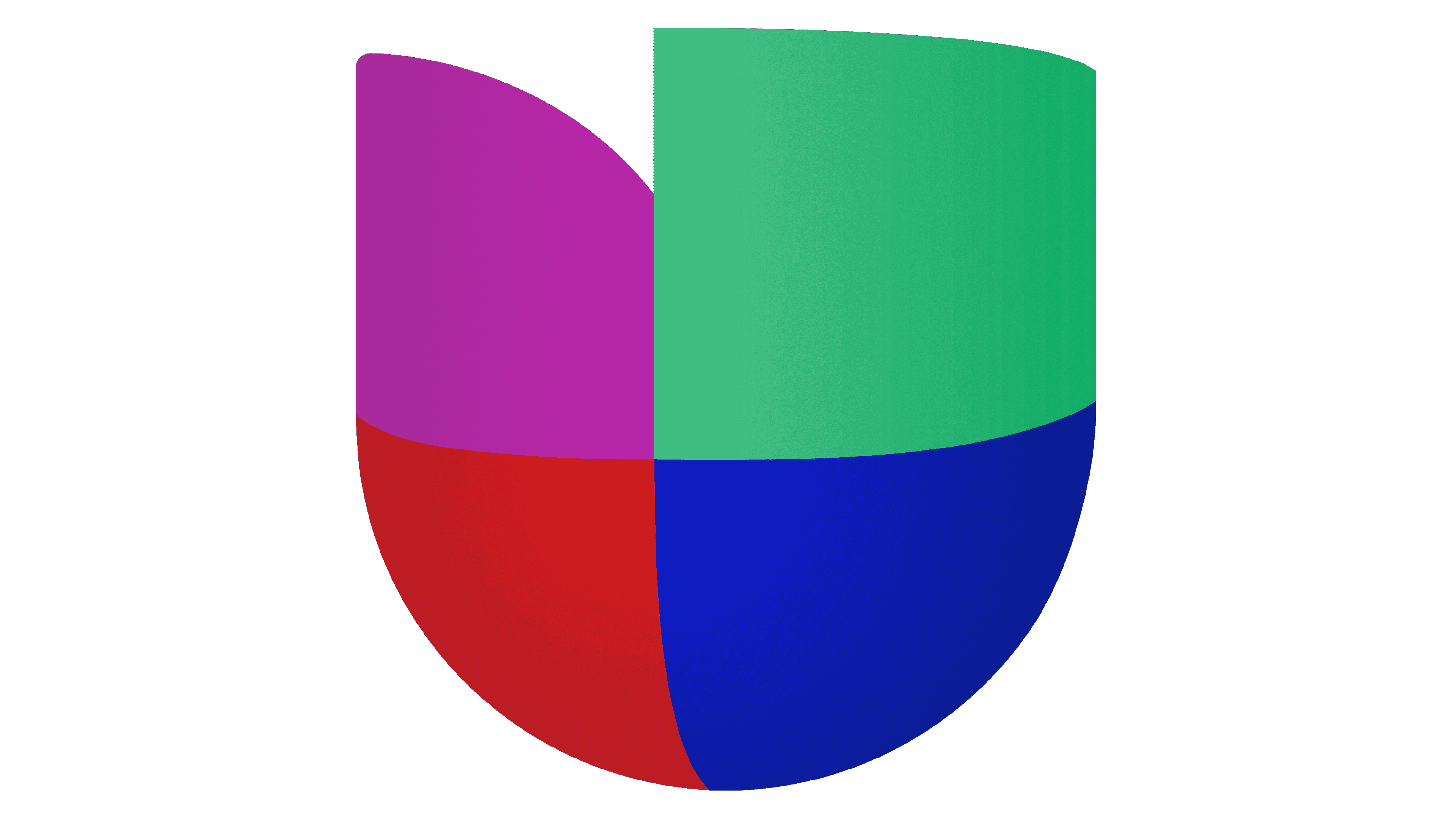
![]()
The redesign of 2012 has played with the emblem from 1990, making it more modern and voluminous. Each fragment of the crest was three-dimensional and had its surfaces colored in gradients. As for the lettering, it was also rewritten and now boasted a calm gray shade and a progressive sans-serif typeface with full-shape uppercase characters.
2019 – Today
![]()
In 2019 the Univision logo was refined again, with the colors of both elements darkened up and intensified. The glossy gradients were removed from the crest, along with the transparency effect, yet the volume is still there. The wordmark has kept its size and typeface, but in a new shade of gray, it started looking more confident and stable.
Font and color
The bold and stylish lettering from the official logo of the Univision company is a sleek and progressive Posterama 1984 Bold, with arched contours of the characters and straight cuts of the bars. It looks very up-to-date, and balances the calm gray color of the wordmark, adding style to it.
As for the color palette of the Univision visual identity, it is composed of four bright shades — purple, green, red, and blue, which stands for variety, multifunction, progressiveness, and a fundamental approach.


