The Union Pacific Corporation is a major American railroad holding company. Its history can be traced to 1862, but, in its current form, it was incorporated in 1969.
Meaning and history
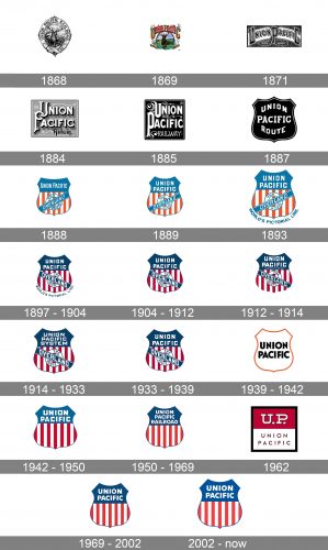
The Union Pacific logo has gone through at least 27 notable modifications. Despite this, it has almost always been loyal to its key themes: strength and connection to America.
What is Union Pacific
The Union Pacific Railroad is a freight-hauling railroad operating over 50,000 km routes in 23 U.S. states. Its parent company is the Union Pacific Corporation.
1868
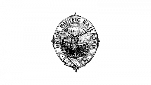
The earliest known logo already features a mountain elk and train, which have been associated with the brand ever since.
1869
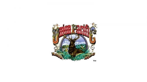
The mountain elk logo existed in more than one version. The company name could encircle the image or could be arced above it.
1871
When the company was taken over by T.A. Scott, the brand identity went through a complete overhaul. The elk and the road were gone. Instead, there was only the name of the company, which was arced and adorned by decorative details.
1884
The new wordmark logo mixes styles. The “U” and “P” interlace and have curvy ends resembling medieval coats-of-arms. There are also more modern spirals. The glyphs “nion” and “acific” would have looked contemporary even 100 years later, if not for the serifs.
1885
Again, curls are combined with heavy and straightforward glyphs. Anyway, the logo is legible enough, which is already something that wasn’t taken for granted in its era.
1887
This is when the first shield was introduced. It was created by the passenger agent Edward L. Lomax. The shape, which is used as the symbol of strength, has been the foundation of the Union Pacific logo ever since.
In the original shield, there is only the company name in a “strong” type featuring the glyphs that were very clean for that time. The background is solid.
1888
For the first time, the red and white stripes paired with blue fields appear. In this way, the company creates a strong link with its country.
1889
The version that had only slight differences from its predecessor was used occasionally in the early 1890s.
1893
The company’s financial situation was unstable. In an attempt to attract more passengers, a new president added the tagline “The World’s Pictorial Line” to all the versions of the shield.
1897 – 1904
The company went bankrupt and then was purchased by a group of businessmen including E. H. Harriman. The latter introduced a new shield, which was used for the following 44 years, with subtle alterations.
These versions were nicknamed Bend Sinister Shields, because the blue stripe tilted downward to the right, creating the Bend and the Sinister side of the logo.
1904 – 1912
While the primary UP logo featured the tagline, the shield was also used without it on some occasions.
1912 – 1914
The lettering “Standard Road of the West” was added following the division of Union Pacific and Southern Pacific in 1912.
1914 – 1933
When the Oregon Short Line and Oregon Washington Railroad & Navigation Co. became part of the company, the word “System” appeared on the logo.
1933 – 1939
The original Harriman shield returned. The tagline was gone.
1939 – 1942
The simplified version of the Union Pacific logo was created under the influence of Modernism and the Streamline style.
1942 – 1950
The Overland bend and annulet disappeared. The palette got lighter.
1950 – 1969
The blue grew darker, and the word “Railroad” was added.
1962
The square versions were nicknamed “Campbell Soup” logos.
1969 – 2002
The 1950 version made a comeback. In 1981, the Corporation and its other subdivisions got separate logotypes, while the original shield was now used only by Union Pacific Railroad Company.
2002 – present
There were a couple of subtle tweaks here and there, which didn’t affect the overall style.


