The University of Connecticut (UConn) emblem is known mostly due to the success of their men’s and women’s basketball teams, the UConn Huskies. For instance, their women’s basketball program is considered the most successful one in the US.
Meaning and history
The University, which was founded in 1881, has its own crest depicting an oak twig. There are three leaves and two acorns, encircled with the lettering, which includes the name of the university and the year it was created. The logotype is given in navy blue or black. However, actually it is not the UConn logo itself, but the emblem of its sports program, the Huskies, that is better known.
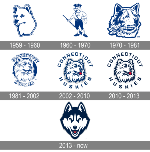
1959 – 1960

A simple portrait of a dog facing left is done in white with blue accents and serves as the only element of the UConn logo. The drawing has a thin white followed by a blue outline to give it a more defined look. This logo looks nice and clean, but the sad look in the dog’s eyes makes it a bit less attractive.
1960 – 1970
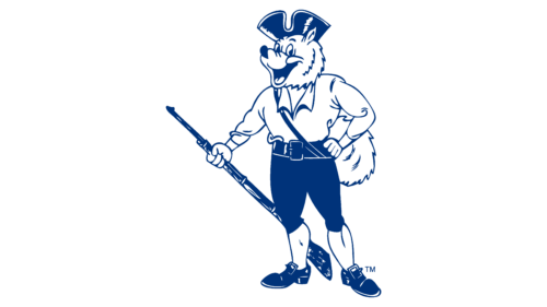
The new logo seems like the opposite of the previous version. It depicts a cartoon-style drawing of a cheerful dog that is presented as a minute man with a rifle in his right hand. He is fully dressed with a hat completing the look and ready for everything that awaits him. They continued to use a dark blue and white color palette. This logo looks more inviting and surely attracted more people to the university.
1970 – 1981

The husky dog portrait was brought back. This time, though, it is not only facing the other way but is done in very close detail. The dog is no longer sad but rather has a thoughtful, serious expression. It seems like such a logo is more appropriate for a higher educational institution. Just like in the previous versions, the logo has no inscriptions.
1981 – 2002
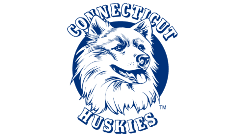
In 1981, the university introduced a logo that has been used for over 30 years. It had a very realistic, almost like a photo, portrait of a husky dog. It had stuck its tongue out and looked very friendly. Behind the dog, there was a dark blue round background. There was also an inscription that curved above and below the emblem. it said “Connecticut Huskies” in white serif letters with a dark blue outline that created a three-dimensional look.
2002 – 2010

The logo was modernized in 2002. The husky was now a drawing that is based on the photo used in the previous logo. They also added a light gray outline instead of the blue round base. The name was printed in a different style with letters being spaced wider apart and further from the image. The new font featured sans-serif, all uppercase letters of a blue color.
2010 – 2013

An updated version of the logo looked more serious thanks to a darker blue color. The drawing and inscription looked unchanged though. This logo showed just how much a shade of one color can change the feeling an image would give.
2013 – Today
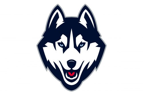 At the beginning of the 2013 – 2014 season, a completely new UConn logo was introduced. Here, the University’s mascot, the Jonathan Husky, looked more aggressive and determined. The emblem was developed by the Nike design team headed by Clint Shaner, senior graphic designer at Nike.
Football
The history of the football program at the University of Connecticut started in 1896. Today, the team competes in NCAA Division I FBS. The UConn Huskies (or Connecticut Huskies) have won 25 conference championships, 15 shared and ten outright.
Basketball
The men’s team has been slightly overshadowed by the success of the women’s basketball team. The men’s team has been the NCAA Tournament Champions on four occasions, while the women’s team has won 11 NCAA Titles. However, when the UConn Huskies old logo made its first NCAA Tournament appearance in 1951, it was on the uniforms of the men’s team, while the women’s team made its debut in the NCAA Tournament only in 1989.
Baseball
The team coached by Jim Penders is supposed to move to the Big East Conference after the 2020 season. The Huskies are a member of NCAA Division I. As of 2019, they have made 21 NCAA Tournament appearances and five College World Series appearances.
The UConn Huskies logo history has been somehow related to the success of the athletic program. Sometimes, the university has decided to modify the brand identity and the logo in an attempt to break a series of unsuccessful seasons.
Font
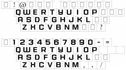
The typeface featured in the Husky Dog logo is a solid, sans-serif all-cap one. It is unique due to the unusual combination of curves and angles in the letters “U”, “C”, and “O”. The “Husky Pride” and “Students Today, Huskies Forever” logos sport a different typeface, which look more regular.
Colors
In addition to the University’s official colors, navy blue, grey, and white, the UConn logo also features a light shade of blue for the dog’s eyes, and the red color for the outline.
NAVY BLUE
PANTONE: 289 C
HEX COLOR: #000E2F;
RGB: (0,14,47)
CMYK: (100,76,12,70)
WHITE
PANTONE: OPAQUE WHITE
HEX COLOR: #FFFFFF;
RGB: (255,255,255)
CMYK: (0,0,0,0)
GREY
PANTONE: 429 C
HEX COLOR: #7C878E;
RGB: (124,135,142)
CMYK: (33,135,13,40)
RED
PANTONE: 185 C
HEX COLOR: #E4002B;
RGB: (228,0,43)
CMYK: (0,93,79,0)


