Cal State Northridge Matadors Logo PNG
Cal State Northbridge Matadors is the name of an athletic collegiate program from the California State University in Northbridge, LA, which was established in 1958. The program is composed of 17 men’s and women’s teams, which compete as a part of the first division of the National Collegiate Athletic Association.
Meaning and history
Cal State Northbridge Matadors have been a member of the Big West Conference (established in 1969) since 2001, while some of the teams of the program compete under the wing of the Mountain Pacific Sports Federation (volleyball and track and field). Overall, the CSNM program is composed of seven men’s and ten women’s teams and is better known for its achievements in men’s soccer and women’s volleyball.
What is Cal State Northbridge Matadors?
Cal State Northbridge Matadors is an athletic program of the California State University in Northbridge, Los Angeles. The program has several teams which compete in 19 sports disciplines, including Basketball, Baseball, Track and Field, Water Polo, and others.
In terms of visual identity, the Cal State North ridge Matadors program is pretty consistent, having all of its logos throughout history drawn in one colors palette, and with one main symbol, which was refined and redrawn at least three times during the years.
1988 — 1998
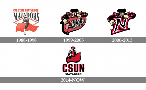
The Cal State Northbridge Matadors athletic program logo, designed in 1988, featured a badge composed of several elements: a matador in black and white with the red waving fabric, drawn on a background with a boldly contoured rhombus, which was horizontally stretched. Above the rhombus, the bold red “Matadors” wordmark was set in the uppercase of a heavy serif typeface was set, with its bottom line repeating the triangular shape of the rhombus’ peak. Above the red logotype, the black underlined “Cal State Northbridge” inscription was set in a straight line, written in all capitals of a slightly narrowed bold sans-serif font.
1999 — 2005
The redesign of 1999 introduced a modern and cool logo of the Cal State Northbridge Matadors teams: a boldly detailed drawing of a matador holding the smooth red banner with a thick black outline. The stylized inscription in three levels was diagonally placed on the banner and featured a black, white and red color palette. The “N” in the “Northbridge” was enlarged and executed in an interesting designer font with the vertical bars composed of some kind of arched elements.
2006 — 2013
In 2006 the Matador’s logo was simplified, and instead of the red banner with the full logotype, the Matador was holding an enlarged letter “N”, which was drawn in the same style as on the previous badge. Now the details of the letter could be seen better, and its sharp serif with elongated tails looked like arrows, showing the spirit of the program and the strength of its teams.
2014 — Today
The badge with the stylized “N” was replaced by the new one in 2014. The rethought design of the Cal State Northbridge Matadors logo features a large “CSUN” abbreviation (standing for the name of the university), set in a bold wishbone-style font, in black with a red outline, underlined by the wide and heavy “Matadors” in black capitals. Above the inscription part, there is an image of a matador with the red muleta, which boasts a thick black outline, balancing the bold letters of the abbreviation.


