TVOKids is the name of the kids content broadcaster, established in Canada in 1994. The brand, which was originally known as TVO Children’s, is specialized in programs for preschool age and has several educational tv-shows along with mobile applications in its portfolio.
Meaning and history
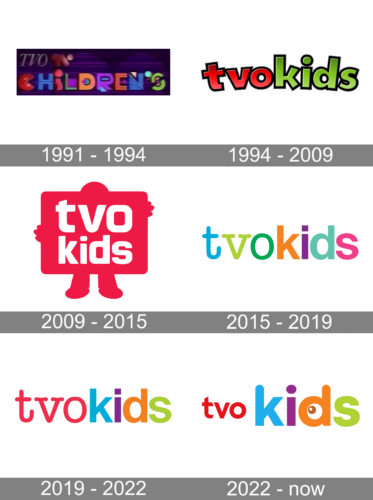
One of the oldest programming blocks for kids in Canada had had a long and intense visual identity history with numerous redesigns held throughout the years. Established as TVO Children’s, the brand was renamed already in 1994, but the logo kept being changed.
What is TVOkids?
TVOKids is a channel on Canadian TV that teaches youngsters with pro-edu shows. It’s part of the Ontario Educational Communications Authority (TVO), a public group that makes educational media and digital learnables for pupils, instructors, and moms/dads in Ontario.
TVOKids gives out lots of programs – with animations, live-action, and game-like activities – to sharpen reading, math, science, social, and other skills. It’s broadcasted nationwide and praised for safe, reliable, and kick-butt edu content.
1991 – 1994
The original badge from the programming block was designed in 1991 and stayed unchanged for almost three years. It was a dark gradient purple background with two levels of inscription set over it. The upper level featured a thin and elegant “TVO” in all capitals of an italicized serif typeface, while the bottom level featured an ExtraBold stylized “Children’s” in the uppercase, where each letter was drawn in its own geometrical style and color.
1994 – 2009
After the block was renamed to TVOKids in 1994, the logo was redesigned too. The new concept was quite minimalistic, and contained a bold bright logotype in the lowercase, with the “TVO” in red letters and black outline, and “Kids” in green and black. The letters of the inscription were jumping and evoked a very friendly and playful mood.
2009 – 2015
The design concept of the TVOKids logo was completely changed in 2009. It was a bold and modern badge, with the human figure holding a large rectangular banner with rounded corners. Both the figure and the banner were executed in one solid color, which varies depending on the needs — it could be pink, blue, red, green, yellow, or even black. As for the lettering, it was always set in bold white letters over the screen and used a modern sans-serif typeface with soft outer contours and straight ends’ cuts.
2015 – 2019
The redesign of 2015 simplified the concept but intensified the color palette of the TVOKids logo. It was a lowercase logotype in two different fonts — with “TVO” being a smooth serif typeface, and “Kids” in a bold traditional sans-serif. Each letter of the wordmark was set in its own color — turquoise, light green, and dark green for the first part, and orange, purple, blue, and pink for the second. The inscription could be set in two lines, or one horizontal, depending on the needs and placing.
2019 – 2022
In 2019 the badge was redesigned again, keeping the previous badge as the example, but slightly refining it. The “TVO” got slightly smaller and was now set in intense pink, while the “Kids” remained absolutely untouched in terms of contours and size, but got the colors brightened up and made more solid.
2022 – Today
TVOKids’ latter logo features a playful design. The logo consists of the word “TVOKids” in lowercase letters, with each letter in a different color (purple, green, blue, orange, and red). The red portion ‘tvo’ is made considerably smaller than the word ‘kids’ placed on its right-hand side. A little dark orange and white eye watches somewhere with naive curiosity.
Color
The friendliness and playfulness of the TVOkids channel can be seen in the striking color palette of its logotype. The brand’s key hues – violet, as well as bright green, red, orange, and blue reflect the channel’s commitment to bringing joy, happiness, and carelessness to children around the world.
Font
The font used for the logo is modern and rounded, adding to the fun and energetic vibe. Overall, the TVOKids logo is designed to appeal to its target audience of children and convey a sense of learning, creativity, and fun. That’s white the designers used bold lines and circled angles and tips in the design of the letterforms.


