Google Hangouts is an online messenger, launched by Google in 2013. The chat software started as a part of the Google+ pack but grew into a separate division. There are two main sub-products in the Hangouts range: Google Meet and Google Chat.
Meaning and history
Created in 2013, Google Hangouts had its original visual identity based on the logo of its predecessor, Google Talk, which was launched in 2005 and had a bright and friendly emblem, composed of a “Talk” wordmark in the lowercase which every letter in its own color, and a black-white-gray dialogue cloud on its right.
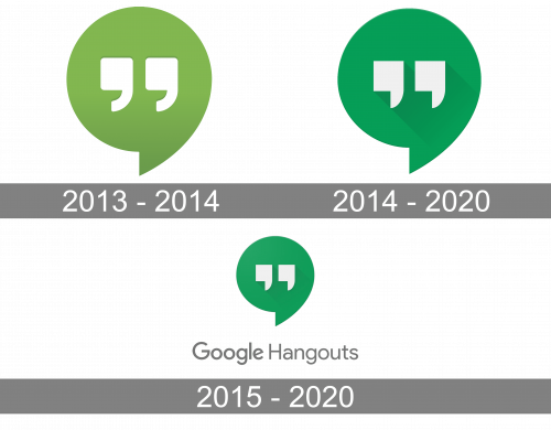
2013 – 2014
The first logo for Hangouts was designed in 2013 and only stayed for one year, though it became a base for the following version, which lasted much longer.
The green dialogue symbol with two white quote signs in the middle. Nothing else, no lettering no more details. Minimalistic and contemporary.
Green is the symbol of growth and white — of loyalty and transparency, and this is how Google sees what it does, while connecting people from all over the world, giving them an opportunity to communicate and share their most important moments.
2014 – 2020
In 2014 the logo was redesigned, but the concept remained the same. The green of the cloud was changed to a more intense and calm shape, white the quotes remained white, but gained a light shadow, which added a three-dimensional effect to the whole image.
This logo stays with the company until the end, but one year later after its creation, the additional logotype was designed.
2015 – 2020
The Hangouts logotype was introduced in 2015 and was used by the company until 2020 along with the green and white graphical version. Two logos were used separately, depending on the placement.
The text-based logo was composed of two parts — the bold sans-serif “Google” and the lighter “Hangouts” inscription, placed on its right. Both parts were executed in strong gray, which symbolizes professionalism and stability, pointing on the expertise and authority of the brand and their ability to provide users with the best services possible.
The green and white emblem was instantly recognizable across the globe, is bright and friendly, while the gray logotype was more a corporate representative, adding solidness and power to the whole visual identity.


