

![]() Libra Logo PNG
Libra Logo PNG
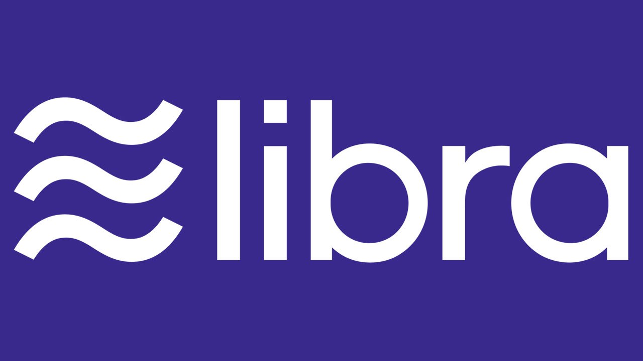
The logo of the currency Libra has been criticized for plagiarism and lack of symbolic clarity. When you ask yourself: “What’s this logo trying to say?” you can hardly find a good answer.
Meaning and history
News about Facebook’s currency first leaked in May 2019, while the formal announcement followed on June 18. Facebook plans to release the first version in 2020. According to the company, Libra will be backed by financial assets to avoid volatility.
Criticism of the symbol
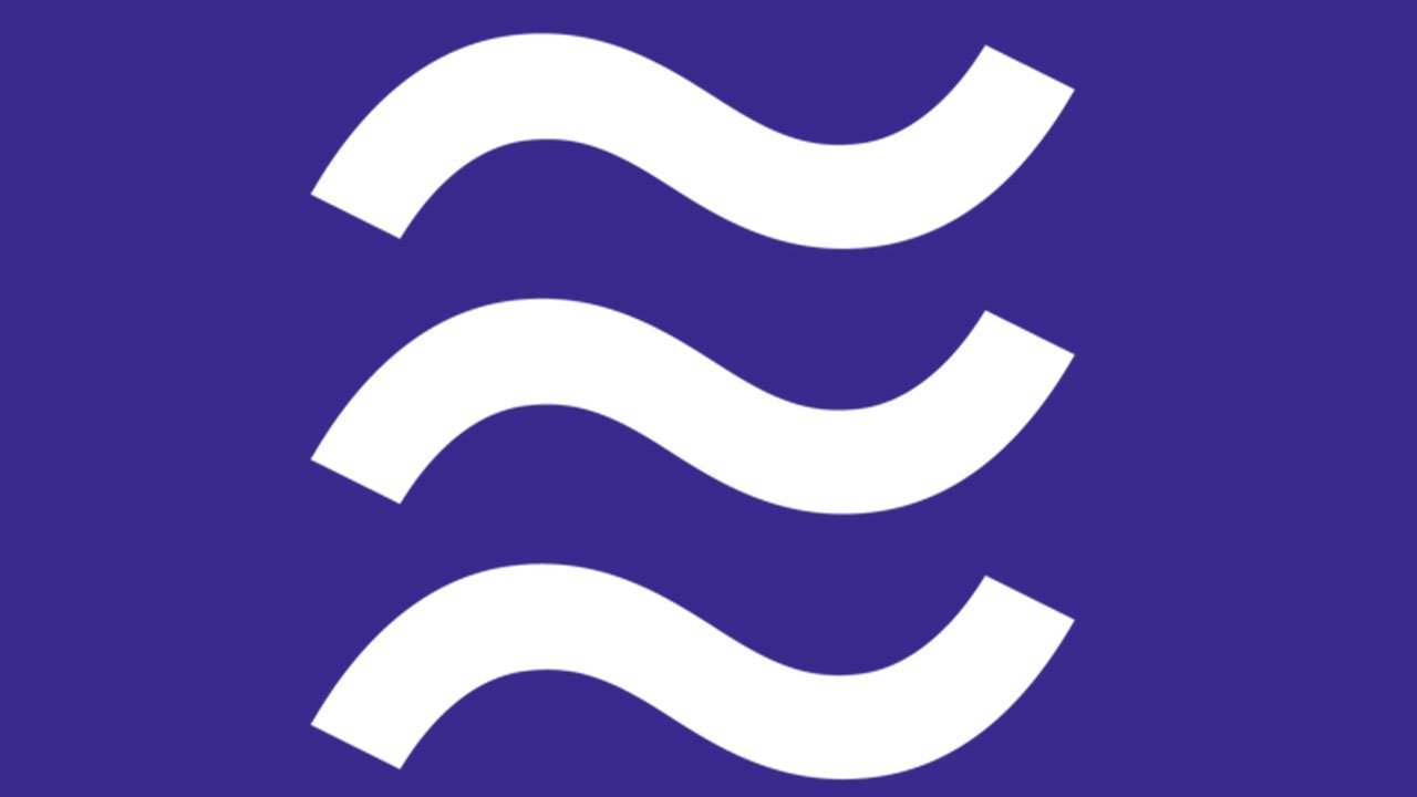
- The Libra logo looks like the Aquarius symbol, which causes confusion.
We don’t see anything wrong with the fact that a cryptocurrency features a zodiac-inspired symbol. The problem is it uses the name of one star sign, Libra, and the symbol of a different star sign, Aquarius. At least, it looks pretty close to the Aquarius symbol.
Using elements of a single symbolic system in such a controversial manner is an unpardonable crime against clarity.
- The tilde sign means “approximately,” which is hardly beneficial for a currency.
Even if your job isn’t connected with numbers, you probably remember the meaning of a tilde from your school math class. We place a tilde grapheme in front of a number to say “approximately.” So, what would you prefer, having $100 or “about $100”?
At this point, you may argue that the Libra logo has not one but three tildes. Come to think of it, this makes the meaning even worse. Now, the sum of money becomes not just “approximate,” but “triple approximate.” Isn’t it even more confusing?
Once again, you may argue that in case of any cryptocurrency, approximate value and volatility are inevitable. However, judging from the Libra founders’ position, it was designed to maintain a stable value. Why the three tildes then? Don’t they contradict the very idea of a “stable value”?
- The Calibra logo resembles the symbol of an existing online bank.
Calibra is a Facebook spinoff company, through which users will gain access to Libra. Calibra’s branding is closely interrelated with Libra’s.
The fintech startup Current, which was established in 2016, posted a tweet comparing its own emblem with Calibra’s. There was also an ironical comment: “this is what happens when you only have 1 crayon left.” In the cold light of the day, Calibra’s logo looks almost exactly like the Current emblem given in violet.
- The logo has several other negative connotations.
People would always elaborate about possible negative connotations for any popular symbol or new name. Yet, we can’t but mention the tweets calling the Libra logo a “runover hamburger menu” and saying it reminds the waves we draw to show something stinky.
Calibra vs Current emblem controversy
![]()
While we’ve already mentioned the similarity of the two logos, there’s something that makes things even worse. Both the logos appear to have been developed by the same San Francisco design firm called Character (purchased by Dentsu in 2018). Interestingly, Current isn’t included on the client list on Character’s web site, while Facebook is.
Neither Facebook nor Character didn’t respond to requests for comment of this fact, which only reinforces the impression this hadn’t been a mistake or oversight
Font
![]()
The clear contemporary sans has classic proportions and is highly legible.
Colors
The Libra logo features a dark shade of blue with enigmatic purple nuances.


