True is the largest telecommunication and rebroadcasting conglomerate in Thailand, headquartered in Bangkok. They’re in charge of the nation’s largest internet operator named True Internet, the TV service named True Visions, and they control one of the country’s most successful mobile internet providers. Half of the company’s shares are held by Charoen Pokphand Group – another multi-direction conglomerate, based in Thailand.
Meaning and history
True was born in 1990 as a TelecomAsia. They were the first Thai company to provide high velocity ADSL internet and the cable internet in 2001, through their sub company named Asia Internet at the time. The next year, they started providing mobile internet. In an effort to transform Telecom into a single brighter brand, in 2004 its name, as well as its subsidiaries’ names, were changed to True.
By 2006, True has made TV service to provide entertainment to its customers. The first 3G internet was brought to the country in 2011 by the company, marking its shifting to world’s standard. Finally, the 4G appeared in True’s products list in 2013-2014.
What is True?
True is a Thai media company, which is focused on providing fast and stable internet of wireless and cable types for mobile and home usages. In the list of their services is TV equipment installation as well. This is the largest communications company in the country, which is situated in its capital, Bangkok.
1990 – 1990s
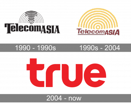
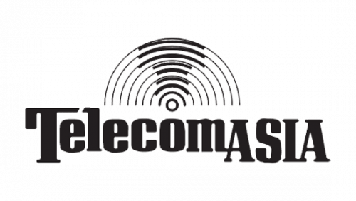
Their first logotype, used before getting any fame, was the nameplate, written in a black font with prominent serifs. The ‘Asia’ word was uppercase, as well as the first ‘t’ letter. Above it, there are multiple waves drawn in semicircle, getting larger from the lowest wave to the top one. The starting point for all waves was a small empty dot. The parts of waves, which were located above this dot, were colored bolder.
1990s – 2004
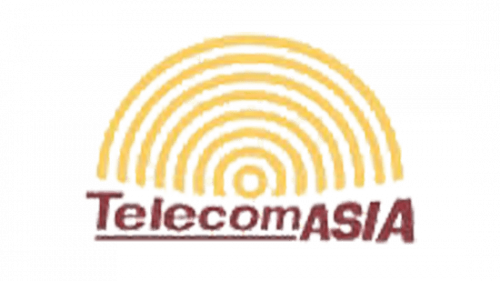
The redesign brought waves, which were colored yellow. Below, they wrote the red nameplate. Its ‘telecom’ portion was underscored, while the uppercase ‘Asia’ part made an optical illusion with its letters, getting larger from the first to the last one. The word looked like it’s inclined a bit.
2004 – today
After the redesign, they wrote just the name without any other features or background.
Font
This text caption was completely lowercase, it had a sans-serif typeface with minuscule gaps in between, and most letters (‘t’, ‘r’, and ‘u’) had rounded corners at their bars.
Color
This nameplate was painted red, which highlighted it on almost every background, and made it eye-catching.


