MTM Enterprise is not just the name of a lm entertainment company but also the initials of a great American actress, Mary Tyler Moore, who founded the studio in 1969. In the 1960s, the actress became famous for her role in the sitcom “The Dick Van Dyke Show”. In the 1970s, she became the heroine of the comedy show “The Mary Tyler Moore Show”. Ms. Moore has won seven Emmy Awards and three Golden Globes during her career. She was also nominated for an Oscar for her role in Ordinary People.
Meaning and history
Mary Tyler Moore was born on December 29, 1936, in Brooklyn, New York. Widespread fame Moore brought the role of Laura Petrie in the sitcom “The Dick Van Dyke Show”, where she played from 1961-1966. The actress won two Emmy Awards for Best Actress in a Comedy Series and a Golden Globe Award for Best Actress in a Television Series.
Mary Tyler Moore founded the production company MTM Enterprises in 1969. Her first venture was The Mary Tyler Moore Show. After the success of the show, her business began to expand, and in 1972 she launched “The Bob Newhart Show,” which achieved success by running on screens for six seasons, and then a spin-off of “The Mary Tyler Moore Show” – “Rhoda” with Valerie Harper.
In the eighties, the studio’s most successful projects were the series Blues Hill Street (1981-1987), Remington Steele (1982-1987), St. Elsewhere (1982-1988), and Newhart (1982-1990). In 1984, Moore started a record label, MTM Records, based out of her studio.
After a string of marginally successful projects in the first half of the nineties, MTM Enterprises was sold to 20th Century Fox on August 15, 1998.
What is MTM?
MTM was the name of an American entertainment company and television studio, founded in 1969 by the famous actress Mary Tyler Moore. The name of the company is based on the initials of its founder, who was also the main star of the project, and its greatest inspiration.
In terms of visual identity, MTM Enterprise is more a parody than a serious designer work. The logo of the company is based on the famous Metro Goldwyn Mayer roaring lion insignia, as the MTM abbreviation is very similar to the MGM, and this made up a funny joke.
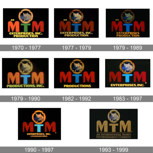
1970 – 1977
The very first logo was created for MTM Enterprise in 1970, and all further versions were just different modifications of this original badge. It was a combination of bold stylized MTM lettering in coral-red, green, and dark red, and a graphical element set above it. The emblem depicted a photo of a ginger kitten enclosed in a circular golden frame made up of a classy ribbon.
1977 – 1979
The redesign of 1977 replaced the kitten photo in the emblem with the new, even more, comic one, and switched the color palette of the lettering to bright red and blue, with both “M”s now set in one shade, and the smaller “T” becoming a strong separation line between them.
1979 – 1989
In 1979 the entertainment company started using different cat photos for the different programs they were launching. One of them was a black-and-white kitten, while all others still featured a light orange one, but in different positions and decorations.
1979 – 1990
The redesign of 1989 has worked more with the additional elements of the logo, and shortened the “Enterprises Production” tagline to just “Productions Inc” written in the uppercase of the same stylized sans-serif font and the main wordmark, in a light and blurred shade of yellow.
1982 – 1992
The smooth yellow of the tagline was changed to a bright and juicy shade in 1992. Also, the “Inc.” part was removed, and now the badge got more balanced and still stayed pretty much informative. The shades Of other elements were also cleaned up and brightened.
1983 – 1997
In 1983 the blue shade of the “T” was lit up, and now this letter worked as the main accent of the composition. The whole lettering part of the logo was slightly expected, with more air in between the characters and the more stable contours of the uppercase letters.
1990 – 1997
The redesign of 1990 has added the “A TVS Entertainment Company” tagline to the composition, with the narrowed uppercase lettering in small capitals enclosed between the two horizontal thin lines. Apart from this, a new version of the logo was introduced — a golden one, with all the elements in their places, but a new color palette, looking more lively and fresh.
1993 – 1999
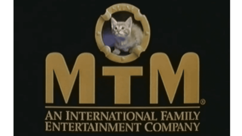
The last logo for the MTM Entertainment company was created in 1993, and didn’t differ much from all the previous versions, but had some small modifications. The main one was in the color of the “MTM” abbreviation, which turned to gold from a usual colorful palette. The golden wordmark was underlined by a thin gold horizontal line and a two-leveled golden inscription in the uppercase of an elegant serif typeface.
Font and color
The bold uppercase lettering from the primary MTm logo was set in a custom designer typeface with massive characters, softened angles of the “M”s, and straight geometric cuts of the “T”, balancing the composition.
As for the color palette of the MTM visual identity, its last version was based on a combination of gold and black, which looks chic and elegant and evokes a sense of excellence and determination.


