![]() Ninja Turtles Logo PNG
Ninja Turtles Logo PNG
Several generations of kids have grown up watching cartoons or films about four anthropomorphic turtles that are fighting crime.
Meaning and history
![]()
Fans of comics read the first book of the series “The Teenage Mutant Ninja Turtles” in 1984. It was created by two artists ‒ Kevin Eastman and his friend Peter Laird. The success of the comics was so great that three years later a cartoon series based on it appeared. Then there followed movies, toys and video games.
1987 – 1996
![]()
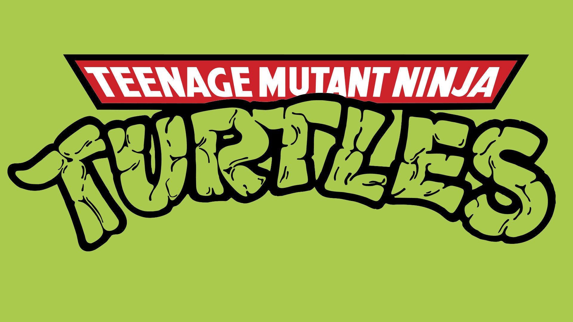
The very first Ninja Turtles logo was introduced in 1987 and stayed untouched for almost ten years. It was a bold stylized uppercase “Turtles” lettering in a cartoonish sans-serif font with the pattern of the letters resembling a pattern of a turtle. The arched inscription was accompanied by a horizontally stretched red banner with the white “Teenage Mutant Ninja” wordmark set on it in a bold geometric sans-serif font. Both the banner and the characters of the “Turtles” were heavily outlined in black.
2003 – 2006
![]()
The redesign of 2003 has introduced a sharp and modern version of the Ninja Turtles badge, with the original composition kept, but redrawn in a progressive gradient style. The red banner turned black, and the white characters were now set in gradients from red to yellow, with some volume added. As for the main part of the logo, the “Turtles” wordmark, it was also set in gradients, but green ones, and featured elongated lines with pointed ends, outlined in white and black.
2006 – 2008
![]()
In 2006 another version of the Ninja Turtles badge was created. It was the fully-preserved logo from 2003 but accompanied by a blue ribbon, arched under it, and coming from behind the composition, evoking a sense of speed and circular motion. The blue ribbon in a black outline boasted a bold white “Fast Forward” inscription set on it.
2008 – 2009
![]()
The redesign of 2008 was responsible for the most modern and brutal badge of the franchise. It was a bright gradient green “TMNT” abbreviation (standing for the “Teenage Mutant Ninja Turtles”) in a stylized geometric sans-serif font, accompanied by a flat green “Back to the Sewer” tagline, executed in a handwritten cartoonish font. The characters of both levels were outlined in black.
2010 – 2015
![]()
In 2010 the logo, designed for the animated series in 2003 came back but got one thing added. It was a bold orange Nickelodeon logotype in lowercase, written in its corporate typeface above the Ninja Turtles badge. This version was used by the franchise for five years.
2012 – 2017
![]()
A very bright geometric logo was used by the franchise from 2012 to 2017. It was a brown-yellowish green “Turtles” in a stylized square sans-serif font, accompanied by the bold black “Teenage Mutant Ninja” set in the same font, but with black bodies of the letters having some parts a bit erased, which added uniqueness to the badge, and made it look very cool and progressive.
2018 – 2020
![]()
For another season of the animated series, the new logo was designed in 2018. In its composition, it was similar to all the previous versions, but the style of the lettering was changed, and the color palette was switched to smooth green shades, from very light ones to medium shades. The upper part of the logo got another line, it was “Rise of the”, set in bold white capitals against a black background of a geometric banner.
2022 – Today
![]()
The redesign of 2022 was held for the release of the Ninja Turtles movie, so the only important addition to the badge, created in 2019, was the “The Movie” wordmark, executed in bold capitals and placed on the bottom part of the logo. This tagline can be seen both in white and red colors, depending on the placement. Also, the color palette of the whole badge was significantly brightened up, creating a more vivid mood.
Original Emblem
But it was the Ninja Turtles logo that appeared first. It was just a joke. To make his friend Laird laugh Eastman sketched a turtle with nunchaku. It was standing upright and there was a mask over its eyes. Above it Eastman wrote “Ninja Turtle”. Laird drew another one. Eastman in his turn depicted four turtles with different weapons. Laird added “Teenage Mutant” to the words “Ninja Turtle”. Then they wanted to write a story about these characters.
The 1987 Cartoon Symbol
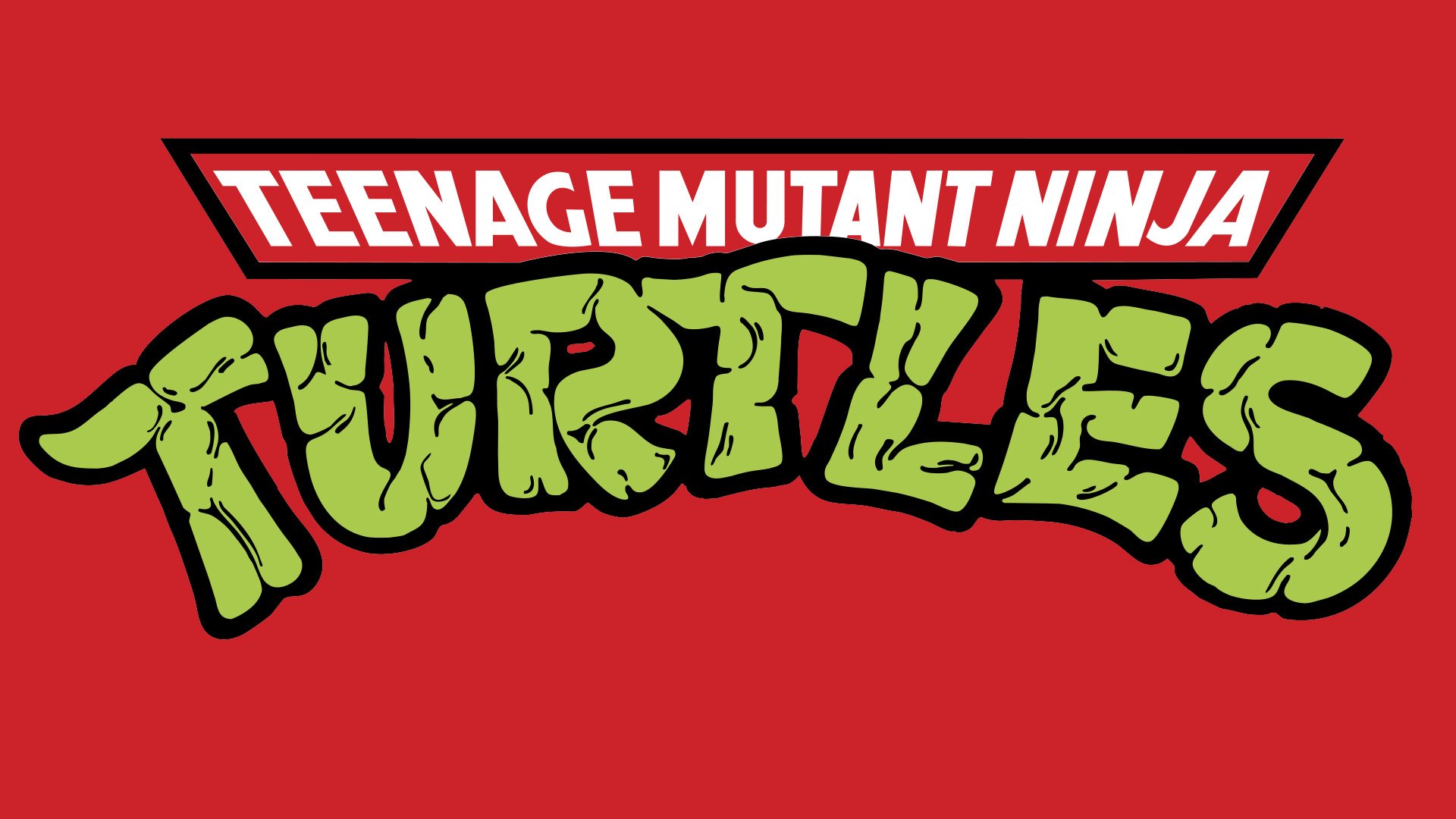
It features the same lettering as the original Ninja Turtles logo ‒ “Teenage Mutant Ninja” in white uppercase letters on a red banner and the word “TURTLES” below it. The arched “TURTLES” is in green and turtle stylized. The typeface is thick and somewhat distressed.
![]()
Font