VIVA is the name of a music tv-channel which was established in 1993 in Germany and closed in 2018. The channel was created as the European competitor to MTV and was running pretty successfully. In 2005 it was acquired by MTV and 13 years later — closed by the mother company.
Meaning and history
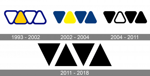
The visual identity of the German music channel has always used one structure and composition, though it was redesigned in 2011 in order to add sharpness and progressive feeling to the image.
1993 – 2002

The 90s logo is just four blue triangles with white (and yellow – in one instance) innards. The direction of each consecutive triangle is switched, making it possible for them to be very close together. Notably, the last triangle is narrower than other, for some reason.
2002 – 2004
The original Viva logo was introduced in 2002 and featured nothing but four triangles with rounded angles. The first and the third figures were pointing down, repeating the shape of the letter “V”, while the second and the fourth trie angles had its peak on top.
There were different versions of the color palette used by the channel — from monochrome, where three out of four triangles were colored black and the second figure was white with a thin black outline, to blue and yellow, a combination evoking a sense of friendliness and joy.
2004 – 2011

In 2004, they translated the previous logo into a black-and-white format. All but the yellow one were completely darkened, while the latter was also given a sizeable white core.
2011 – 2018
After the acquisition by MTV, Viva redesigned its logo in 2011, keeping the triangular composition, but refining and elevating it. Now the geometric figures got its sides straight and its angles sharp. Considering the new strict and cool style, the color palette was switched to a complete monochrome, with all the triangles in solid black, placed on a white background.
The Viva logo was something completely different from everything you could see on the market. It was modern, powerful, and memorable, reflecting the channel’s character and its focus on young audiences with good taste.


