Topman is a British label of men’s apparel retailer and manufacturer, which was founded in the 1970s, and is one of the most popular casual men’s brands worldwide. The brand is a part of Arcadia Group.=
Meaning and history
Topman is a brand of men’s youth clothing, shoes, and accessories.Currently, the brand is owned by the Arcadia Group, which also owns such brands as Burton, Dorothy Perkins, Evans, Miss Selfridge, Topman, Topshop, and Wallis.
Topman originated in 1978 as Topshop’s menswear collection. After that, these two brands went side by side. The clothes are made in the same factories and the brand’s concepts are very similar.
In 1994, opened a common brand store in London, Topshop-Topman, which covers 90,000 square meters and is the largest store of clothes in London.Topman produces men’s clothing, shoes, and accessories.
What is Topman?
Topman is the name of a famous British fashion brand, which was established in the 1970s, and today is owned by Arcadia Group. The brand is specialized in the production of clothing and accessories for men, with its collections following the latest fashion trends, and the garments available at very affordable prices.
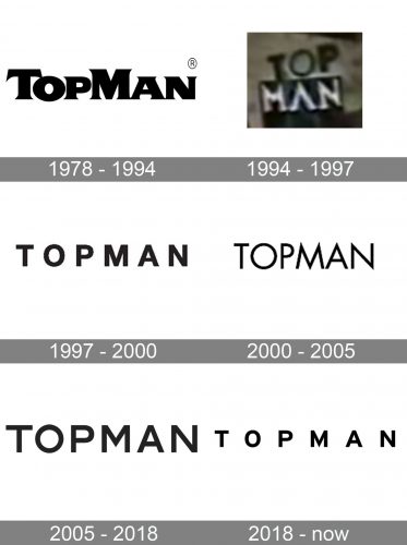
1978 – 1994

The oldest Topman logo in the list showcased the name of the brand in a very bold, heavy type. The structure of the letters wasn’t unusual, but the sharp serifs added a unique touch making the logo recognizable.
1994 – 1997
The vertical version features the word “Top” above “Man.” The “A” lacks the horizontal bar, which makes it look unusual.
1997 – 2000

The vertical version features the word “Top” above “Man.” The “A” lacks the horizontal bar, which makes it look unusual.
2000 – 2005
The glyphs have grown lighter and taller. They stand closer to each other, but the “sandwiched” effect hasn’t returned.
Some of the square ends have been replaced by sharp angular ones (note, for instance, the “M”). Also, a notable change in the widths of the letters has taken place. For instance, the “O” is now a circle instead of the oval.
2005 – 2018
This one is like a mix of the previous two versions. It has preserved the circular “O,” but the sharp tops of the “M” and “A” have again been replaced by square ones.
2018 – Today
The Topman logo is composed of a bold and confident wordmark in a monochrome palette.
The all-caps lettering of the nameplate features classic sans-serif font Intestate. It has clean and straight lines, quite minimalist, but condensed and strong.
The black lettering of the wordmark looks good on any background, but the company prefers using white for its visual identity. The timeless black and white combination of the logo makes it elegant and stylish, evoking a sense of power and trust to the brand.
The Topman logo is modern and simple, it shows the brand’s values of quality and design and doesn’t feature extra graphical details, as they are not needed — the label speaks by its fashion products.
It is a brand for young people who value freedom and creativity most of all, and the brand represents the new generation, moving forward and progress.
Font and Color
The modern and stable uppercase lettering from the primary Topman badge is set in a bold and clean sans-serif typeface with distinctive contours of the characters, straight cuts of the lines, and right angles of the bars. The closest fonts to the one, used in this insignia, are, probably, Organetto Bold, or Sandalwood JNL Regular, with some minor modifications of the contours.
As for the color palette of the Topman visual identity, it is simple and minimalistic, with the plain black lines of the letters, set against a white background. This powerful and strict color solution always looks great for any badge, making it timeless and sophisticated, at the same time evoking a sense of strength and progressiveness.


