

![]() Crocs Logo PNG
Crocs Logo PNG
The logo of the shoe brand Crocs is instantly recognizable due to its main character, a crocodile. It certainly doesn’t look like the logo of any other shoe brand.
Meaning and history
![]()
Crocs is a relatively young company that achieved phenomenal success in almost no time. Producing comfortable and easy-to-wear clogs manufacturers with innovative foamy material, the company made its shoes iconic and the logo — instantly recognizable.
The name of the brand, Crocs, came to the founder’s’ mind when they looked at their clogs from the side, and they resembled them a crocodile snout. The funny thing is that the material, the famous clogs are made from, is called Croslite, and its name appeared long before the brand was launched.
2002 – 2006
![]()
The original Crocs logo, designed in 2002, was composed of a green emblem, placed on the left from the monochrome wordmark in all capitals. There was also a playful green tagline, “Get a Grip”, placed under the right part of the main inscription.
The green emblem depicted a funny smiley crocodile, which had green contouring. The image of a creature overlapped the first letter “C” a little.
As for the inscription, it was executed in a custom sans-serif with extra-bold black lines, and thin white ones, coming through their middles, to make the logo lighter and more dynamic.
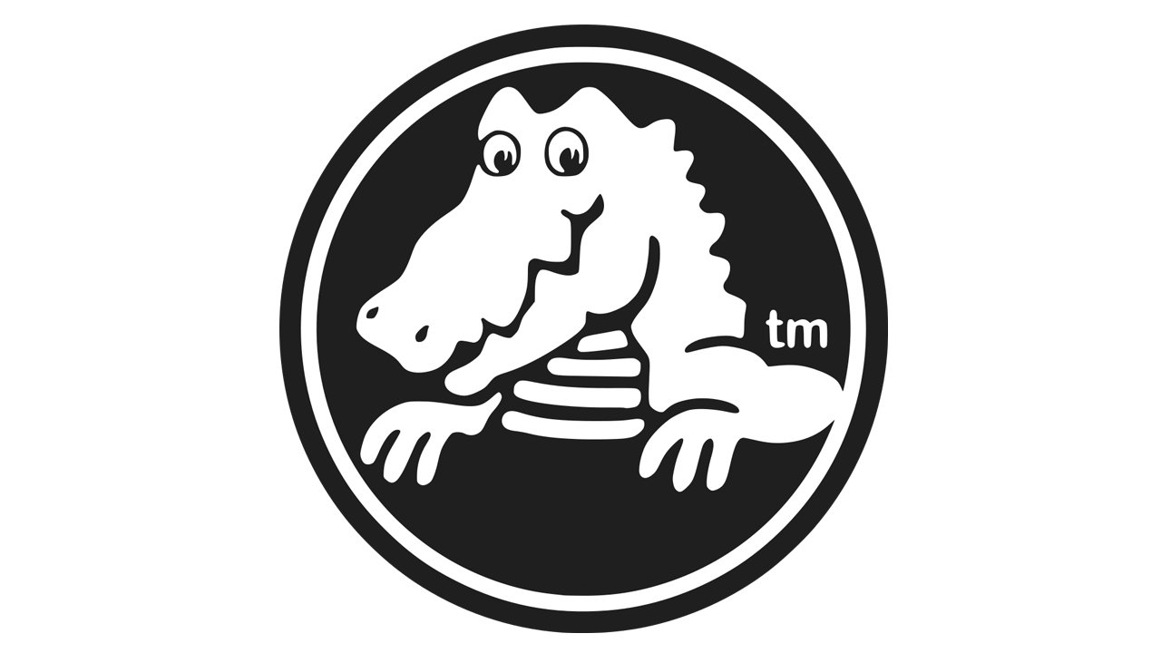
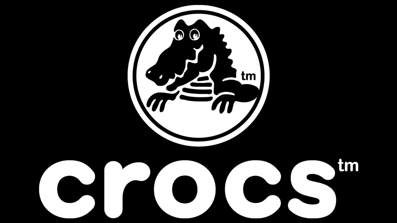
2006 – Today
![]()
The redesign of 2005 brought the look we all know now to the brand. Today the Crocs logo features a solid black and white emblem, where the iconic crocodile is drawn in where on a black background, and outlined in black and white.
The wordmark in the lowercase is written in a bold rounded sans-serif typeface and placed under the circular emblem.
There is also a reverse color option of the shoemaker’s logo, which is not common, but still used by the brand, as well as the logotype without any additional graphics.
Symbol

The Crocks logo features a crocodile. To be precise, you can see its head and upper part of the body (with the two upper paws) placed inside a circle frame.
Wordmark emblem
The lettering looks friendly and modern due to the rounded shape of the glyphs. The insignia features lowercase letters based on a circle shape.
Font
The type used for the Crocks logo is very similar to AG Book Rounded BQ-Bold, and yet, you may notice quite a few differences, if you take a closer look. While the designer might have used this font as a base, he customized the proportions of the glyphs and the width of the lines, which resulted in the wordmark having a unique style.
Colors
![]()
The crocodile and the wordmark are typically given in black and white, and still, you probably have come across a neon green version of the Crocks logo.
Why is the Crocs logo a crocodile?
Both the name of the brand and the logo of the company are derived from a Crocodile, because the most iconic product of Crocs, the rubber sabots, looks like the head of a crocodile, and the name itself is derived from the “Crocodile”.
How can you tell if Crocs are fake?
On those Crocs models where the logo is placed on the shoe, check that it is not a sticker but a buckle or a button with an indelible Crocs branding. Also, if you have the original, the word Crocs will definitely be engraved on the back strap or the back of the sole if the model has no strap.
What animal is on the Crocs logo?
The animal on the logo of the Crocs brand is a Crocodile. This is not just the image, but a symbol of the brand, and an animal, which gave the name to the company. The crocodile was adopted as the Crocs’ mascot, as the brand’s sabots look like a head of a crocodile.
Why do Crocs have 13 holes?
The iconic Crocs rubber shoes have 13 ventilation holes on the surface, which you can also use for decoration purposes, putting branded icons, which can be bought separately. Due to the holes, the feet in the Crocs sabots breathe and feel very comfortable.


