Top Gear is the name of the tv-show about cars and other vehicles, which was first released in 2002 in the United Kingdom. Today it is one of the world’s most famous and successful series in the motor vehicle segment, which has released more than 200 episodes.
Meaning and history
Based on the motor vehicle tv-series from the 1970s, Top Hear also uses its logo as an inspiration. The relaunched version of the world’s famous project adopted the rounded gear from the original logo as the main graphical element, but fully redrew it and switched the color palette.
1977 – 1983
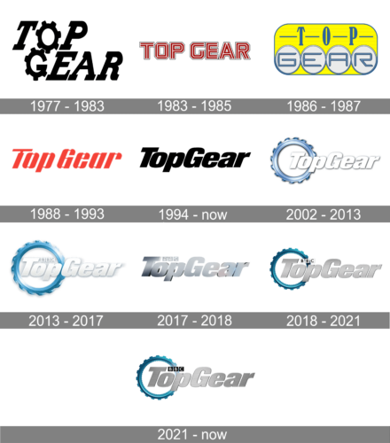
The very first Top Gear logo was created in 1977 and featured a bold black stylized inscription placed on a plain white background. The lettering was executed in the uppercase of a bold slanted serif typeface, with all letters narrowed and “O” and “G” drawn like gears. Some of the angles were straight, while others rounded, and the tail of the “R” was playfully curved.
1983 – 1985

The redesign of 1983 introduced a completely different version of the Top Gear logo. It was a red black and white composition, with the wordmark set in one line and written in the uppercase of a custom sans-serif typeface with geometric contours of the letters. The main thing about this emblem was the striped red and white pattern of the letters, which made the whole logo unique and recognizable.
1986 – 1987

In 1986 Top Gear tries something new. It was probably the brightest and the strangest badge along all, created for the tv-show throughout its history. It was a harpoon tally stretched yellow banner in a thin blue outline. The rounded angles of the badge were complemented by four white circles placed along its bottom line. Outlined in blue, they had blue “Gear” lettering on them, while the “TOP” was placed above it in all capitals of a joke narrowed serif font, with all letters separated from each other by thin horizontal lines in the same shade of blue.
1987 – 1993
The redesign of 1987 adopted a red color palette for the Top Gear insignia. It was a stylized italicized inscription in red with all letters composed of thick elements, connected with thin lines from the upper and the bottom parts. Each letter of the title case wordmark looked like a Gear itself.
1994 – 2001
In 1994 the YV show starts using a bold and masculine black logotype, set on a plain white background. The italicized logotype in the title case was executed in a traditional yet extra-bold sans-serif typeface with clean contours of its stable and solid letters.
2002 – Today
Actually, there are two main logos in use by the tv-show today. One of them is a bold black logotype, designed in 2002. The inscription with “T” and “G” capitalized is executed in a solid typeface, which is very similar to Neue Helvetica Extra Black Oblique, which is pretty simple, yet looks powerful and masculine despite being italicized.
2002 – 2013
In 2002 the second version of the logo was designed. It was the same style as the wordmark, but in white color, placed over a three-dimensional blue gear. The emblem was located behind the first part of the inscription, “Top”, and featured a gradient blue and metallic gray shades. The wordmark has a very delicate and light gray shadow.
2013 – 2017
In 2013 the color of the gear was elevated to a brighter and more intense shade of blue, which was now closer to turquoise. The shadow of the wordmark became larger and the “BBC” logo appeared above the main lettering.
2017 – 2018
For one year, from 2017 until 2018, the tv-show uses a logo without a circular gear. It was a pretty short experiment, where the lettering was made three-dimensional and used gradient gray color, looking like a glossy car badge. The “BBC” logo above it was executed in the same color palette.
2018 – 2021
2018 – Today
The gear comes back to the TopGear logo in 2018 and looks like it is there to stay. Redrawn in a more geometric and strong way, it now features a dark turquoise color with gradient shades and thinner contours. The inscription has a light silver tone, which looks like a matte metal badge, and the “BBC” above it is executed in black and gray, where black letters are placed on silver squares.


