Canal+ is a French entertainment TV channel launched in 1984. The programs mostly include French and international shows, movies and cartoons. It’s considered one of the major and most popular such channels in the country, going as far as launching its broadcasting in the United States in 2018.
The channel is owned by Vivendi, a large media holding company based in Paris. The most popular types of entertainment offered by Canal+ are French and American TV shows. In the case of latter, they are typically broadcast in English with French subtitles, and the principle is similar for other international shows.
Meaning and History
Canal+ was launched in 1984 in Paris. Launched in the major media holding company Vivendi, the channel gradually grew to become one of the most popular on French television. The name means ‘Channel Plus’ in French, which essentially signifies the large spectrum of entertainment offered by the channel.
What is Canal+?
Canal+ is a major French entertainment channel launched in 1984. It mainly airs French and American TV shows and cartoons. That being said, they also broadcast entertainment shows from Britain, Japan, Canada and Ireland. The genres cover a large spectrum from comedy to drama to adult film and beyond.
1984 – 1995
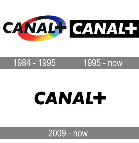
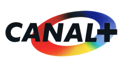
The original emblem displayed the channel’s own name placed in front of an oval ring. The latter was rather on the emblem’s right side, as well as the center. Its right end was slightly elevated. The coloring was mainly represented by the red on the left, the blue on the right and a gradual flow of one into the other in the middle parts.
The name bit consisted of large, capitalized letters of a bold sans-serif font. They were tilted slightly to the right and were colored black in the main variation. Depending on the background, they could turn them white.
1995 – today
The next emblem is instead just the name bit, exactly as it was before and placed into a plain black rectangle. The letters were by contrast white, but the appearance changed very little otherwise.
2009 – Today
In 2009, they released another version of the previous logo, used in parallel with the 1995 design. It’s essentially just the wordmark, all other elements are removed. They typically color it black.
Font
The font used in all Canal+ logotypes is a regular enough sans-serif typeface. It’s bold, with sharp angles and slightly tilted to the right. That doesn’t apply to the ‘+’ sign, which stands perfectly upright. The letters are capitalized in all variations.
Color
The coloring scheme has since 1995 been black and white for the majority of design elements in Canal+ branding. In the logo, it means that the letters are commonly white, whereas the rectangular background behind them is black. However, the channel name can be used separately on occasions and painted other colors for various purposes.


