When it comes to professional sports, the significance of logos for clubs and federations cannot be overstated. Each team’s logo embodies its distinctiveness and heritage. A beautiful and stylish logo is as much a source of pride as a winning trophy. Crafting such an emblematic symbol, like the team logo, demands considerable time and effort. Often, the creation of a new team logo is a collaborative endeavor involving not only professional designers but also the inputs of passionate fans.
These logos frequently encapsulate a slice of the team’s history, portraying team mascots, landmarks of the city or country they represent, and their past sporting triumphs. To ensure a logo’s uniqueness, attract attention, and secure a place in memory, designers employ various design elements. They carefully select logo fonts, typography, and color choices to create an eye-catching logo that resonates with the spirit of the sport.
Moreover, the designers’ insight into the respective sport is reflected in how they blend logo colors and design elements. A clean font might be used to represent the clarity and focus of an athlete, while a bold clean font can symbolize the strength and determination of the whole team. The right sport logo often includes an icon or a memorable word that captures the essence of the sport, such as a heart symbol or a globe, indicating the team’s international reach or universal appeal.
In modern sport, the abundance of original logos presents unlimited possibilities for creativity. From stand-out sport logos that rise above the competitors to serious sport logo designs that reflect the team’s ethos, the range is vast. This diversity is why we’ve curated a sport logo shortlist, showcasing the top-50 most beautiful and recognizable logos, adored by millions of fans worldwide. Each logo in this collection, whether a perfect sport logo or a version of your logo that resonates with your team’s spirit, is a testament to the respective owners’ dedication to excellence in sports and design.
50. Bohemians Praha 1905
49. Derby County
The black and white sheep, serving as the mascot of “Derby County,” exemplifies simplicity and elegance on the club’s logo. This design choice aligns with a trend observed in the history of sports logos, where fewer colors and straightforward imagery often lead to a more impactful representation of a professional sport logo. The utilization of just black and white in Derby County’s logo not only makes it visually striking but also imbues it with a sense of identity that fans of the favorite team can easily recognize and relate to. This approach mirrors the effectiveness of a popular song; it’s memorable, distinct, and resonates deeply with the audience. The black and white sheep thus becomes more than just a mascot; it’s a symbol woven into the fabric of the team’s identity, celebrated in the world of sports branding.
48. Denver Broncos
The professional American football club, in a strategic move, chose a horse head with an orange mane as its logo – a design that exudes both purpose and menace. This selection reflects a thoughtful consideration of design themes, emphasizing the way colors and logo type can project a team’s character. The use of clean fonts alongside the vibrant orange mane in a beautiful sport logo like this adds to its visual appeal.
Moreover, the logo, presumably created in a vector format, ensures that its quality remains intact across various mediums, a crucial aspect for wide-reaching brand recognition. The right colors, in this case, the striking contrast of the horse head against the orange mane, play a significant role in making the logo not only eye-catching but also emblematic of the team’s dynamism and strength. This careful blend of elements – from color schemes to font choices – underscores the importance of a well-thought-out logo in the world of professional sports.
47. Hull City
Hull City, a professional football club from England, has chosen a “Growling Tiger”, their team mascot, as the central image of its logo. This choice is deeply rooted in adventure and the team’s spirit, reflecting the quality appearance that a sport logo rises to embody. The mascot itself emerged as a symbol, inspired by the traditional colors of the team’s uniform – the distinctive black-amber vertical stripes.
The logo design cleverly incorporates these colors and integrates additional text that resonates with the club’s identity, enhancing the overall impact. A transparent background is often employed in such logos to ensure versatility across various mediums, whether it’s team merchandise, digital platforms, or printed materials. This thoughtful approach to logo design not only makes the “Growling Tiger” emblematic of Hull City’s fierceness and dynamism but also ensures that it stands out in the world of sports branding.
46. Persebaya
Another standout logo, epitomizing both sophistication and convenience, comes from the Indonesian club Persebaya, where predatory “guards” – a shark and a crocodile – are artfully depicted around the lighthouse, the symbol of Surabaya city. This logo, with its solid background, serves as a perfect example of how visual representations can convey a club’s character and the trustworthiness of its contributors.
The inclusion of these embellishments – the shark, crocodile, and lighthouse – not only creates a unique and memorable emblem but also reflects the real-life significance of these elements to the city of Surabaya. This logo could be effectively utilized in various applications, from team signage to advertising jingles, thanks to its vivid and distinctive design. A tagline accompanying this logo could further enhance its message, making it an even more powerful tool in the realm of sports branding and fan engagement.
45. Milwaukee Bucks
Despite the fact that since 2015 the main symbol of Milwaukee Bucks – a noble deer – has become more edgy on the new round logo of the club, its straight lines and a horrific look make Milwaukee logo really memorable.
44. Changchun Yatai
Despite its seemingly straightforward design, the logo of the Chinese football club, featuring a duckling with horns and a football, stands out for its originality, albeit with a somewhat childish charm. This emblem, a simple yet memorable representation, highlights the importance of choosing non-offensive names and imagery in sport logos – a factor that clubs must pay attention to.
The duckling with horns, while playful, is a short piece of text or a visual motto, encapsulating the club’s character and the caliber of service it aspires to provide. In the realm of sports branding, where real life and the sports world often intertwine, such logos become more than just symbols; they are memorable words that fans associate with their beloved teams. This logo’s ability to remain simple yet original is a testament to the thoughtful design process that goes into creating effective and appealing sports logos.
43. Pittsburgh Penguins
A hockey club from Pittsburgh, playing in the NHL, has a themed and beautiful logo: Iceburgh penguin on skates and with a hockey-stick.
42. Omaha Mammoths
The professional football team from Omaha, Nebraska, competing in the EFL league, has successfully attracted attention with its beautiful mammoth logo, characterized by huge tusks. This logo, ideally crafted in PNG format and vector files like SVG, demonstrates the perfect convenience and adaptability for various uses, from digital platforms to printed merchandise.
The simple layout of the mammoth, combined with the sharpness of the vector files, ensures that the logo retains its clarity and impact in any size. The choice of PNG and SVG formats is particularly important for sports logos, as teams need to pay attention to how their emblems are reproduced across different media. This focus on detail and adaptability not only enhances the visibility of the Omaha team’s emblem but also reflects the professionalism and modern approach of the club in its branding efforts.
41. Shanghai Shenxin
Chinese professional football club from Shanghai has a brightly colored logo – a cock against the background of a star. In addition to its attractiveness, the color of the cock (yellow / gold) implies constant influence – it is the color of the Earth.
40. Beijing Enterprises
Another Chinese club with bright, spectacular logo. Eagle with the ball on the background of the team colors with a gold rim and ribbon.
39. Tampa Bay Buccaneers
Professional American football club Tampa Bay has a hard to forget logo. Nothing superfluous, at the same time, emphasizing its name “Pirates” – the logo depicts a skull with swords and a soccer ball on a red flag.
38. Benevento
Italian football club Benevento created an excellent logo to match its nickname – “The Witches”. The silhouette of a witch on a broomstick on the background of club colors – you will not confuse their logo with anything else.
37. Hamilton Tiger-Cats
Since 1967, the tiger on the Hamilton logo has always remained the most prominent figure, and after the logo was updated in 2005, the Tiger-Cats logo is indeed one of the most beautiful one in Canadian football.
36. Olympiacos
The Greek football club has quite a memorable logo that emphasizes the history of ancient Greece. The head with the laurel wreath of Olympiakos Piraeus is recognizable all over the world.
35. Las Tunas
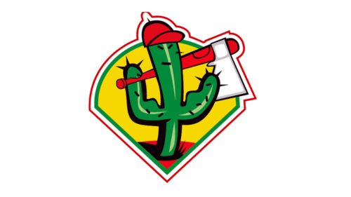
Las Tunas football team from the Cuban National Football League stands out with its more than an extravagant logo – a cactus in a red baseball cap holding an axe in its hands.
34. Cambodian Tiger
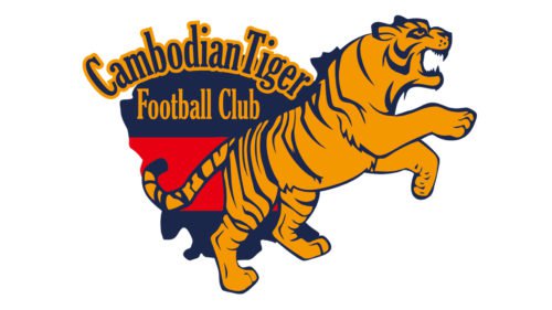
A beautiful logo of Cambodia Tiger with a ferocious tiger. The only thing missing in the logo is its football symbolism.
33. Oldham Athletic
English Oldham Athletic has one of the most beautifully depicted owls among football teams on its logo. This is the club’s mascot – an owl called Cheddie.
32. Tijuana
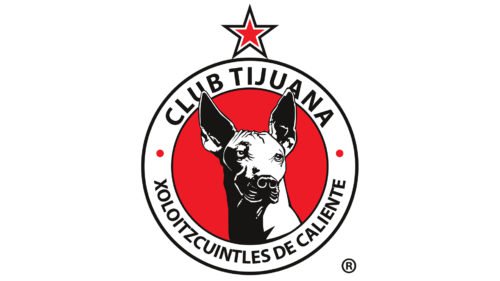
The logo depicts Mexican hairless dog Xoloitzcuintli – the personification of strength and rage of Tijuana.
31. Lleida
Beautiful logo depicting city and a shamrock – the symbol of the region.
30. Aukro Berani Zlin
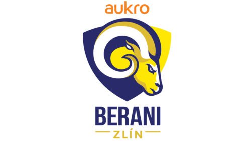
A beautiful logo of the hockey club from Czech Republic called Berani Zlin. Team mascot – ram – is painted in team colors: blue and gold.
29. Minnesota Vikings
The club’s striking logo is a gold-haired Viking with a helmet and horns on its head.
28. East Bay Pit Bulls
Professional basketball team could create an original logo with a pit bull and a basketball – it is immediately clear what team this is and what their nickname sounds like.
27. Modesto Nuts
Modesto Nuts is a small baseball team from the local league in Modesto, attracting attention with its beautiful logo. Yes, even nuts are playing baseball here!
26. Spain national team
The national football team of Spain has a logo created according to all the traditions of heraldry – a shield between the columns, a crown, a retro ball at the bottom, and a gold star at the top.
25. Doncaster Rovers
Doncaster Rovers has a beautiful and at the same time rare for England logo of a golden Viking with a sword. In 1972, the automaker “Rover” agreed to place Viking (the symbol of the company) on a new logo of the club. Fans liked the golden Viking so much that they left it after the end of the contract with “Rover”.
24. Miami Dolphins
The team from Miami can be proud of its wonderful logo! This dolphin in the background of the sun is for sure one of the sweetest mascots in American football.
23. Roma
New logo of the Roman club appeared in 2013, although references to history have not gone away: the she-wolf is feeding two twins – founders of Rome.
22. FC Santa Claus
The logo of the Finnish football team from Rovaniemi city really reminds a fairy tale. Not surprisingly, the logo of the club with the same name depicts Santa Claus with a letter since the team is based in Lappi, the hometown of Santa.
21. Kansas Jayhawks
Sports teams of the University of Kansas traditionally fight their rivals under the flag with this wonderful logo.
20. Catalans Dragons
The ranking of the best sports logos has a place for the French rugby team called Catalans Dragons. The logo with the fire-breathing dragon looks very impressive.
19. Koln
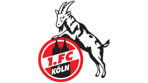
Meet the original logo of FC Koln. It depicts the goat rising above the city of Hennes – it’s the club mascot since 1957.
18. Sampdoria
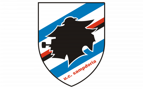
The logo of the Genoese club is not only beautiful, but it also has a romantic history. It shows the sailor Giovanni Batista with a pipe in his mouth.
17. Valencia
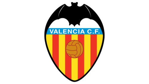
Spanish Valencia traditionally uses a bat and a retro ball on their logo – it looks catchy and spectacularly.
16. Midland RockHounds
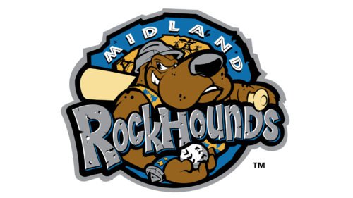
A small baseball team from Texas draws attention with the beauty of its logo: a large brown dog with a bat and a ball. The key thing here is everything looks harmonious and thematically correct.
15. Equipe nationalle de France
National football team of France has one of the most beautiful logos among all national football teams. The symbol of the country – Gallic cock – flaunts against the background of national colors having a gold star on top of the head – the sign of victory at the World Cup 1998.
14. Illawarra Hawks
In 2007, the Australian basketball team Illawarra presented its new excellent logo: a red hawk with large wings holding a basketball in the claws.
13. Olympique Lyonnais
Strict and at the same time beautiful logo of French Lyon. The logo in the form of a shield with the letters OL and a golden lion inside the letter O.
12. Chicago Bulls
Red and furious Benny the bull is one of the most recognizable logos in professional sports. Bulls’ logo looks great.
11. Guangzhou Evergrande
The nickname of Guangzhou – “Chinese Tigers” – is clearly visible on the bright logo of the club. The fire colored logo in the form of a shield with the image of a flaming tiger with a ball looks really beautiful and menacing!
10. Blackburn Rovers
The red rose is enclosed in a blue circle is a stylish logo symbolizing the county of Lancashire and the history of the Wars of the Roses.
9. Boston Celtics
The original logo of the NBA team “Boston Celtics” represents a character of Irish folklore in an old-fashioned hat and vest leaning on a cane and twisting a basketball.
8. Ajax
According to the popular magazine “Four Four Two”, Amsterdam’s Ajax has the most beautiful logo in football. The profile of the ancient Greek warrior is made of 11 lines (the number of players on the pitch).
7. Lampang
Professional football club from the province of Lampang in Thailand depicted a chariot with one horse and a ball on its logo. The logo has an emerald background – a nod to the nickname of the team – “emerald chariots”. Looks very gracefully.
6. Chicago Blackhawks
The logo of Chicago hockey club in the form of a head of a Black Hawk Indian looks very original and carries historical overtones. The team was named in honor of this Indian (during First World War, club founder Frederic McLaughlin served in the division called “The Black Hawk”).
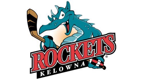
5. Kelowna Rockets
Junior hockey club from WHL has an interesting and cheerful logo: blue alligator with a hockey stick that lacks one tooth in the mouth!
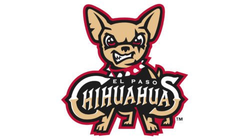
4. El Paso Chihuahuas
This small baseball team from the state of Texas plays in the Pacific Coast League (PCL). The name and logo were approved on October 22, 2013, in honor of the state of Chihuahua located in the north of Mexico and bordered by El Paso.
3. Hibernians FC
Hibiernians Football Club is notable not only because it never left top football division of Malta and became the first Maltese representative in the Euro cups. Hibernians has one of the most beautiful logos in Europe – a peacock with spread feathers standing on the ball (the club represents the city of Paola).
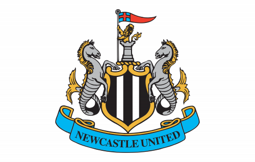
2. Newcastle United
Newcastle football club has an interesting logo that looks very much like the logo of the city itself. It depicts 2 hippocampuses symbolizing the connection of the city with the sea.
1. Bristol Rovers FC
Bristol Rovers’ nickname “Pirates” reflects the maritime history of the city. And the club’s logo – a pirate with a sword in his hand standing with one foot on a football – looks incredibly colorful.


