

![]() Olympique Lyonnais Logo PNG
Olympique Lyonnais Logo PNG
Olympique Lyonnais is the name of the French football club, established in 1950 and based in Lyon. Today the club, nicknamed “Les Gones” (which means “The Kids”), is one of the most popular and successful in France, having Rudy Garcia as a head coach.
Meaning and history
![]() The visual identity of the French club has always been very classy and traditional. Based on the golden principles of the heraldic crests, its logo is powerful, bright, and instantly recognizable. Only one emblem in the team’s history was completely different from all the other versions, but it was a pretty short experiment.
The visual identity of the French club has always been very classy and traditional. Based on the golden principles of the heraldic crests, its logo is powerful, bright, and instantly recognizable. Only one emblem in the team’s history was completely different from all the other versions, but it was a pretty short experiment.
1950 — 1957
![]()
Their first ever logo was a shield shape with a blue frame and two inner sections. About 1/3 of the space was occupied by a white rectangle above. Here, they’ve placed the letter ‘O’ & ‘L’ in blue. The rest of the logo was red and contained a white silhouette of a rampant (‘dancing’) lion.
1957 — 1965
![]()
7 years later, they colored the blue bits purple and slightly rearranged the lion’s pose.
1965 — 1974
![]()
Several things happened in 1965. The frame became a golden color, the lion was given a light blue outline and the letters became further apart. Besides that, the remaining colors were somewhat tweaked.
1974 — 1976
![]()
They rearranged the inner imagery in 1974. Namely, the insides of the shield were mostly red now (except for several stripes of white and blue on the right). The red bit (on the left and in the center) contained the letters (now white), the lion (now orange) and a new soccer ball (white and blue) symbol. Importantly, the letters were now positioned so that the ‘L’ was below and slightly to the right of ‘O’.
1976 — 1977
![]()
For this season, they only adopted the lettering and the lion. The former became white with blue outlining, and the lion turned red.
1977 — 1980
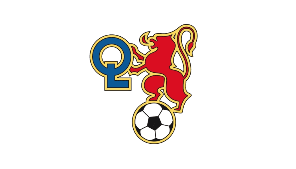
The Olympique Lyonnais logo from 1970 was a very bright and strong emblem with a Royal character and courage. The main element of the logo was a red rampant lion in a gold outline. The heraldic animal was standing on a black and white football and holding a stylized key in his hands.
The key was composed of two intertwined letters, “O” and “L”, standing for the club’s name. Executed in blue, they were also outlined in gold.
1980 — 1989
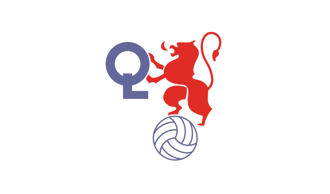
The redesign of 1980 brought a new color palette to the club’s visual identity and modernized its contours. Now the lion on the ball and the key had no outline but were drawn in a smooth contemporary manner with clean sleek lines.
The lion remained red, but both the football and the key were now executed in light purple. The ball was more white, with only thin lines colored, while the “OL” lettering was bold and solid.
1989 — 1996
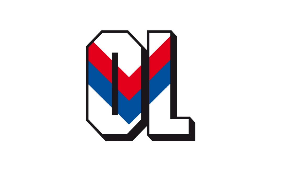
In 1989 a completely new emblem was designed. Stylish and minimalist, it was a celebration of patriotism and looked powerful and confident.
The new laconic logo was composed of two capital letters “OL”, executed in a geo-metric sans-serif typeface, with the white body and thick black outline. The letters also featured a delicate shadow, which made the whole image even stronger.
The main detail of the emblem was the French national flag pattern, which was placed on the letters like a chevron.
This version of the visual identity stayed with the team until the middle of the 1990s and is really a remarkable example of a football club badge.
1996 — 2000
The traditional style and the lion rampant came back to the Olympique Lyonnais logo in 1996. But the composition was different from the one created in the 1979s. Now the gold lion was placed inside a white letter “O”, located inside the blue crest, near to the whole “L”. Both bold letters were outlines in yellow-gold, which was balanced not only by the lion but also by a yellow wordmark on the top part of the shield.
The top featured a red rectangle with the gold outline, and a capitalized nameplate, executed in a simple and clean sans-serif.
2000 — 2006
![]()
The logo stayed virtually the same, except the letters in the red section turned wider and bolder.
2006 — 2022
![]()
The logo was redesigned again in 2006. The composition remained untouched, but the color palette was switched to a more intense one, and the contours of the lion were modernized.
The logo of Olympique Lyonnais, created in 2006 is composed of a dark blue and red crest with a gold outline, two solid “OL” letters in white, the lion rampant placed in the middle of the “O” and a white wordmark, placed on a red background.
Featuring the colors of the French flag, outlines in gold, the club’s logo looks powerful and patriotic, reflecting the winning spirit of the players and their professionalism.
2022 – Today
![]()
A few modifications to the logo made it look brighter and lighter. The red and blue looked more vivid. In addition, there was no more golden outline around the initials and the blue and red elements. The designers though preserved the golden border around the outer edge of the emblem, but also added a complimenting white line. These changes made the emblem look cleaner and modern while preserving the well-recognized visual identity.
Olympique Lyonnais Colors
RED
PANTONE: 2035 C
HEX COLOR: #DA0812;
RGB: (218, 8, 18)
CMYK: (8, 100, 100, 1)
BLUE
PANTONE: 7687 C
HEX COLOR: #14387F;
RGB: (20, 56, 127)
CMYK: (100, 89, 21, 7)
WHITE
PANTONE: P 1-1 C
HEX COLOR: #FFFFFF;
RGB: (255, 255, 255)
CMYK: (0, 0, 0, 0)
GOLD
PANTONE: 4025 CP
HEX COLOR: #D29D46;
RGB: (210, 157, 70)
CMYK: (18, 39, 86, 1)


