Tmall is the name of an online trading platform. It is considered to be a very reliable one because sellers on Tmall are legal entities, which provide a certain package of documents, confirming the authenticity and the real existence of the organization, company — manufacturer, or brand.
Meaning and history
On Tmall you can buy the goods of high-end Chinese and global brands, there are many flagship stores of electronics and technology. Here you will not find any used goods. If you buy a product on Tmall, it will be sold to you by an authorized reseller.
This is the best option because you can count on the high quality of the goods and the respect of the guarantees by the store-seller according to the Taobao policy. Also, your money is always protected: all sellers on Tmall are required to place a deposit on Taobao to immediately cover the customer’s money claims if the situation is resolved in the customer’s favor.
As for the visual identity of the online shopping platform, it has always used red as its main color, though the first two versions of the badge, designed in the period from 2012 to 2017, also had a lot of black in them.
2012 — 201?
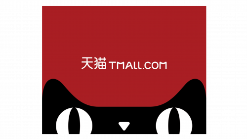
The platform was rebranded from Mall Taobao in 2012, so this is when the first official at mall logo was introduced. It was a solid dark red square badge with a black rounded element on its bottom, depicting the upper part of the black cat’s head. With two white eyes and a small white nose, drawn as a triangle pointing down.
The logotype was written in white smooth sans-serif capitals above the cat’s head, in the center of the square. Two white hieroglyphs were followed by the website name in Latin.
201? — 2017
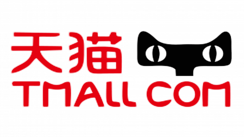
In a few years, the Tmall logo was redesigned, keeping the original color palette and style, though switching colors. Now the lettering was executed in scarlet-red and set on a white background, above the cat’s head which wasn’t much changed, just got its lines softened. Now the Chinese name of the platform was much more bigger than on the previous logo and got it placed on the very top of the badge, above the smaller Latin name of the website, still in the same typeface as on the previous insignia, but drawn in thicker lines.
2017 — Today
The redesign of 2017 simplified the Tmall logo to just a bright logotype executed in a red and white color palette. The official version is red on white, but colors can be used in reverse too. The new badge features one or two lines of the text, with the Chinese part whether on top of the left from the English one.
The typeface remained almost the same, as for the cat — it still can appear on some badge versions from time to time, but the official logo is now a simple red logotype on a white background.
Font and color
The Tmall logotype is executed in the uppercase of a fancy custom sans-serif typeface with smooth arched lines and straight cuts of their ends. There are not many analogs to the font used in the company’s insignia, though the ones, which are the most closes to it are Handmade Noveau JNL (with straight lines softened and shortened), Metaluna Medium (modified lines, but same smooth mood), and Nulshock Bulk (with some contours modernized and bars cut).
The combination of red and white color of the Tmall visual identity stands for variety, passion, and power of the company and its assortment. Red is also a symbol of love, which indicates the attention and care of the company to its customers, and white stands for loyalty and trustworthiness.
Tmall Icon
The Tmall icon got switched from a complicated red, black, and white composition with a cat’s head and lettering to a minimalist and clean badge in red and white. The icon is composed of a plain white square with a bold sleek letter “M” on it. The uppercase letter is executed in the official typeface of the brand and makes the whole icon look like a stylized image of an envelope.


