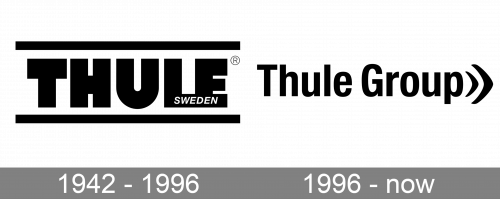
The Thule logo combines a simple and perfectly legible type with a minimalist icon.
Meaning and history
Thule Group AB is named among the world’s largest companies specializing in cargo carriers for automobiles and outdoor and bags market. The group owns various brands offering a diverse range of outdoor and transportation products.
1942 – 1996
The previous Thule Group logo was by far heavier than the current one. It consisted of the word “Thule” featuring a very bold sans. All the letters were capitalized, which added even more weight. The most distinctive part was the extended horizontal bar of the “L,” which merged with the “E” so that the two characters formed a single glyph. The extended bar housed the writing “Sweden.”
While the design forces behind the brand redrew the logo and changed its style, they decided to preserve the original black-and-white color scheme.
1996 – now
The lettering “Thule Group,” which takes up the majority of the surface, is given in a sans serif type featuring classic proportions. Only the initials are capitalized.
To the right, there are two elements that have a somewhat similar shape but different sizes. They resemble the ends of two rounded arrows or the “speed up” icon.


