While the logo of the German shock absorber brand Bilstein is pretty cluttered, it is also unique and recognizable. Also, it looks simpler than the previous version, so we can say that there has been some progress.
Meaning and history
ThyssenKrupp Bilstein GmbH is a shock absorber manufacturer. The company was founded in 1873 by August Bilstein in Altenvoerde in Westphalia, Germany.
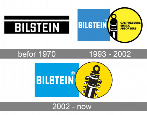
Befor 1970
1993 – 2002
If you are familiar with the brand, you possibly remember other versions. For instance, the one where the shock absorber was positioned vertically and there was the lettering “Gasdruck Stoss-Dampfer” or its English translation “Gas Pressure Shock Absorber.” In these versions, the black outline of the yellow circle looked bolder than in the current Bilstein logo where there is no text.
2002 – Today
The Bilstein logo can be broken down into two shapes: a rectangle and a circle. The rectangle is sky blue and houses the lettering “Bilstein” in white. The designers who worked on the logo opted for a bold all-caps sans serif typeface.
To the left, there is a yellow circle with black trim. The circle houses a stylized shock absorber, the product that has made the company popular. The shock absorber is black with white highlights adding some dimension.


