 Tennessee-Martin Skyhawks Logo PNG
Tennessee Martin Skyhawks is the collegiate athletic program from the University of Tennessee at Martin. The program is composed of 17 men’s and women’s teams in various sports disciplines and is managed by Kurt McGuffin.
Meaning and history
The Tennessee-Martin Skyhawks, the athletic teams for the University of Tennessee at Martin, were established to represent the institution in intercollegiate sports. Their inception marked the university’s commitment to fostering athletic talent and sportsmanship. Over time, the Skyhawks have carved a niche for themselves, particularly in NCAA Division I athletics, as a part of the Ohio Valley Conference. Their journey is adorned with significant achievements across various sports disciplines, especially in basketball and football, where they have clinched multiple conference championships. These accomplishments not only elevated the Skyhawks’ profile in the realm of collegiate sports but also bolstered the university’s reputation. Currently, the Tennessee-Martin Skyhawks continue their pursuit of excellence in athletics, consistently demonstrating high-level performance and playing a pivotal role in enhancing the university’s vibrancy and community spirit.
What is Tennessee Martin Skyhawks?
Tennessee Martin Skyhawks is the name of the sports program, established in the University of Tennessee at Martin. Today the program has various teams, both men’s and women’s, in such sports as Baseball, Basketball, Soccer, and many others, with the men’s basketball club as the most famous one.
2003 – 2008

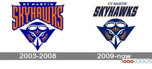
The Tennessee Martin Skyhawks badge, created in 2003, stayed with the club for five years and featured a very bright orange and blue badge with the graphical emblem placed under the stylized wordmark banner. The emblem boasted a stylized image of the hawk head in a pilot helmet with googles. The bird looked powerful and dangerous, reflecting the character of the team and its willingness to win. As for the lettering, it was set in the uppercase and executed in a custom smooth and narrow font with the lines of some letters elongated and sharpened. The white “UT Martin” was set above the fancy “Skyhawks” inscription in an extra-bold sans-serif typeface.
2009 – Today
The current Tennessee-Martin Skyhawks logo, which was introduced in 2009, features a unique character, an anthropomorphized hawk who is also a pilot. Due to the way its muzzle is depicted, the sharp angles and smooth curves, the emblem has a dynamic feel. The italicized type on the top only reinforces the overall impression.


