

![]() Telenor Logo PNG
Telenor Logo PNG
Founded in 1855, Telenor ASA is one of the world’s largest mobile telecommunications companies. The Norwegian company is based at Fornebu in Bærum, close to Oslo.
Meaning and history
![]()
One of the largest mobile operators in the world, serving 140 million subscribers. the company is present in 11 countries and in 19 other countries Telenor operates through VimpelCom Ltd. in which Telenor Group has a 36.36% stake.
Telenor began operations in 1855 as a state monopoly provider of telegraph services under the name Telegrafverket.The first telephone connection in Norway was established in 1878 between Arendal and Tvestrant, and the first international telephone connection between Christiania and Stockholm was established in 1893. Automation of the telephone system began in 1920.
What is Telenor?
Telenor is a Norwegian telecommunications company, which was established in 1855 in Oslo. The majority of the company is state-owned, which guaranteeshigh-qualityconnections and services. The company operates worldwide; with its main markets in Scandinavian and Asian countries.
1933 – 1969
![]()
The initial logo of Telenor was executed in a classy elegant manner and traditional light yet powerful color palette, composed of scarlet red and yellow, with thin black accents and outlines. The composition featured a red and yellow crown placed above an eight-pointed star with six lighting bolts surrounding it. Each element of the logo was outlined in black, which made it possible to place insignia on a background of any color.
1969 – 1994
![]()
The company was founded as Telegrafverket and changed its name to Televerket in 1969. The old logo featured either the word “Tele” or “Televerket” paired with an emblem. The emblem, which was somewhat reminiscent of a lightning bolt, could be interpreted as an abstract flash, signal or wavelength creating a connection between two points separated by a great distance.
1995
![]()
Upon adopting the current name, the company introduced a completely different brand identity. Now the Telenor logo featured a stylized human figure (its upper part, to be precise). The figure had its two hands spread up, and there was again the “signal” going from one hand to the other. To the left, the lettering “Telenor” in an austere sans could be seen.
While the design was still based on the combination of red and blue, like its predecessor, the shades were now lighter.
The emblem was developed by Landor Associates and was designed to be “warm and friendly.”
2001
![]()
The logo preserved its structure but grew more minimalistic. The signal was straightened out into an arch. The human figure lost the white filling. The lettering was now lowercase.
The design was developed by Scandinavian Design Group.
2006
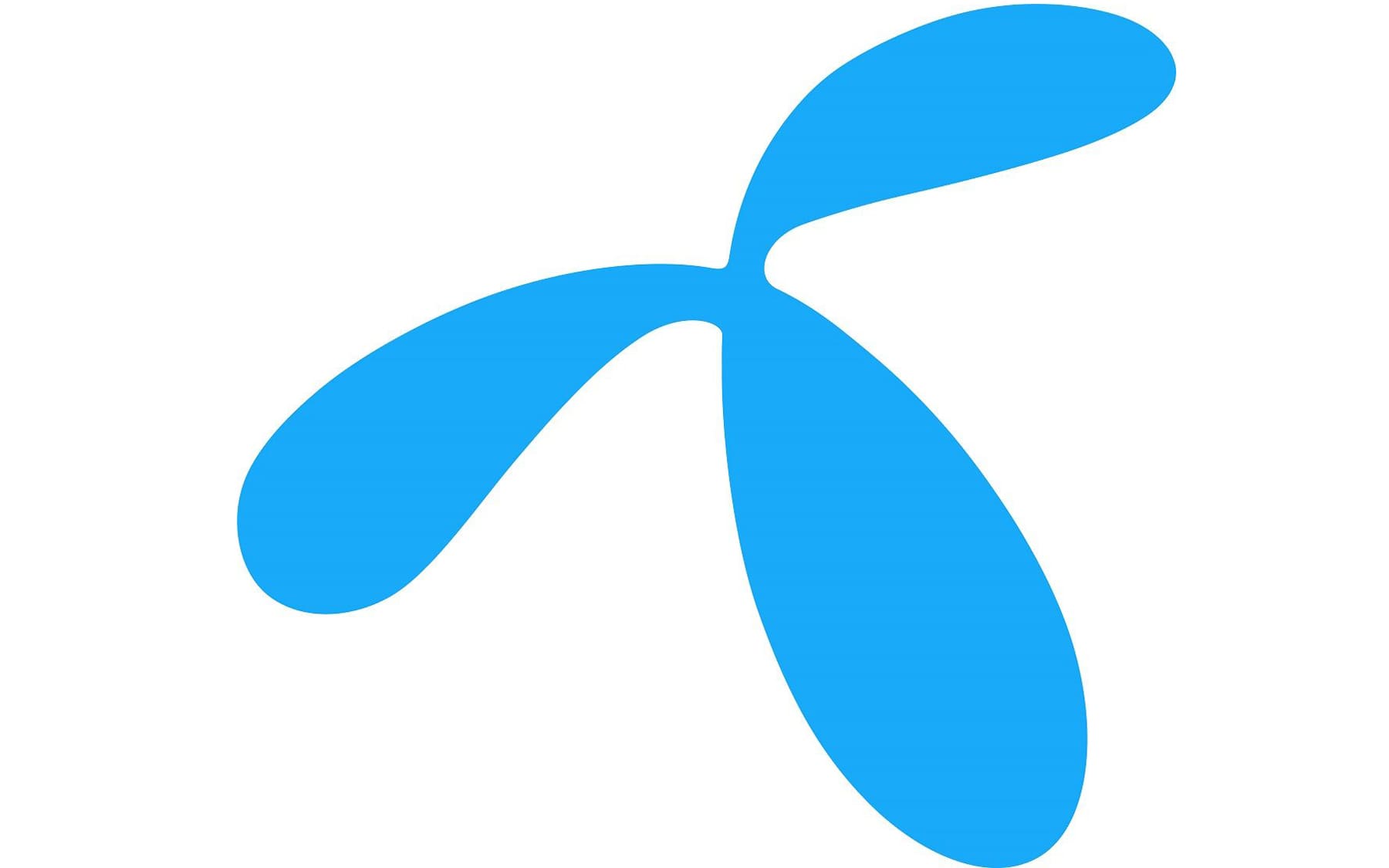
![]()
A completely different Telenor logo was drawn by Keshen Teo of Wolff Olins in London. It was more abstract than its predecessor. The rounded, flowing shape seemed to have been inspired by the innovations in the telecommunications industry.
Font and Color
The airy and elegant lowercase lettering from the primary Telenor logo is set in a lightweight sans-serif typeface with clean contours of the characters and smooth delicate lines. The closest fonts to the one, used in this insignia, are, probably, PF DIN Display Pro Thin, or Nora Rounded Light, but with some minor modifications of the characters’ contours.
As for the color palette of the Telenor visual identity, it is based on a fresh and clean combination of black and blue, with the black elements executed in thin lines and placed on a plain white background, which creates an image, representing loyalty, responsibility, and excellence.


