Telemundo is a prominent Spanish-language television network headquartered in the United States. A subsidiary of NBCUniversal Telemundo Enterprises, it was founded with the aim of serving the Hispanic community, primarily in the U.S. Owned by the media conglomerate Comcast, Telemundo boasts a wide-ranging content lineup from telenovelas, news, sports, and a variety of entertainment programs. Operating predominantly in the U.S., Telemundo reaches audiences in over 100 countries through its international broadcasting. Over the years, the network has cemented its position as a leading source of Spanish-language content, competing fiercely with other giants in the industry like Univision.
Meaning and history
Founded in 1954 by Ángel Ramos in San Juan, Puerto Rico, Telemundo started as a single station. As the years passed, it grew exponentially, transforming into a national network. Throughout its journey, Telemundo has been recognized for its innovative programming, particularly in the realm of telenovelas. Unlike other networks, they began producing telenovelas with a contemporary, edgier twist to resonate with younger Hispanic audiences. This strategic decision elevated their status, making them a household name. Today, Telemundo stands as the second-largest provider of Spanish-language content worldwide, after Univision. Owned by Comcast through NBCUniversal, Telemundo now reaches millions globally with its rich tapestry of content. Its news division, “Noticias Telemundo,” has gained significant traction for its comprehensive coverage of Latin American and U.S. news. As of now, the company remains a formidable force in the entertainment industry, consistently enhancing its offerings and expanding its reach to cater to Spanish-speaking audiences worldwide.
What is Telemundo?
Telemundo is a major Spanish-language television network based in the U.S., catering primarily to Hispanic audiences. Owned by Comcast’s NBCUniversal, it offers a range of content from telenovelas to news, reaching viewers in over 100 countries.
1984 – 1987
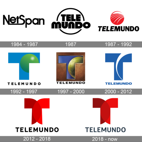
The NetSpan logo is a display of typographical finesse. Sleek and modern, the black-on-white design is defined by varying font weights. The bold “Net” contrasts with the more slender “Span”, possibly highlighting the stability and range of a network. The elongated “t” and “p” subtly connect the two parts of the word, emphasizing unity and continuity. This design suggests a technologically savvy entity that values connectivity, bridging gaps, and ensuring seamless spans across digital realms.
1987
TeleMundo is encapsulated within a semi-circular design, exuding a sense of wholeness and global reach. The typography is bold, with block letters that convey strength and stability. The semi-circle, reminiscent of a rising or setting sun, could symbolize a dawn of new entertainment or information era, indicating that the brand is a beacon in its field. The black and white color scheme adds to its timeless appeal, making it suitable for a broad audience demographic.
1987 – 1992
The logo incorporates a vibrant red sphere adorned with white, sleek lines, mimicking the appearance of a swiftly spinning globe. The sphere, radiant and dynamic, might suggest global coverage or a worldwide perspective. Below, “TELEMUNDO” is boldly spelled out in uppercase, ensuring the brand’s name remains the focal point. The logo radiates energy, passion, and global connectivity, ideal for a brand with international reach and influence.
1992 – 1997
A fresh and contemporary take on branding, this Telemundo logo merges cool blue with a gradient of lively green, encapsulated within the letter “T”. The gradient evokes feelings of growth, evolution, and innovation. The bold, capitalized typography stands firm, asserting its presence, while the gradient-filled “T” adds a touch of modernity. This logo suggests a brand that is both rooted in its legacy and forward-looking, eager to adapt and evolve in a rapidly changing media landscape.
1997 – 2000
This logo is a perfect amalgamation of the modern and traditional. The deep brown backdrop is reminiscent of aged leather, echoing history and a time-honored legacy. Centered prominently is the letter “T”, designed in a brilliant blue that mirrors the sky’s hues. Within the “T” is a depiction of what appears to be a globe or planet, suggesting global outreach and universal appeal. The word “TELEMUNDO” rests below, its white letters standing in stark contrast to the background, ensuring visibility and brand recognition.
2000 – 2012
Minimalism meets elegance in this design. A pristine white backdrop serves as the canvas, making the rich blue “T” pop and catch the viewer’s eye instantly. The letter’s design is smooth with gentle curves, embodying fluidity and forward motion. The brand name, “TELEMUNDO”, is written in a bold yet straightforward font, underscoring the network’s modern approach and commitment to clarity in its messaging.
2012 – 2018
The color red is universally recognized as a symbol of passion, intensity, and power. This logo doesn’t shy away from making a statement with its dominating red “T”. The design is symmetrical, giving it a sense of balance, while the color exudes confidence. Simplicity is key here, with the brand name “TELEMUNDO” written in bold black letters, contrasting starkly with the white background and ensuring that the name remains etched in the viewer’s memory.
2018 – Today
A blend of the old and the new, this logo design showcases a dominant red “T” that is both eye-catching and memorable. The red hue is deep and inviting, symbolic of both passion and determination. The “T” boasts of a unique design, with one arm extending out more than the other, giving it a modern, asymmetric appeal. Below the “T”, the brand name “TELEMUNDO” is written in a contemporary font, emphasizing the network’s commitment to staying relevant in today’s fast-paced media landscape.


