Comcast is one of the largest cable tv providers in the United States, which was established in 1963 as American Cable Systems. Today the corporation also produces various tv programs and provides Internet services for individuals and commercials. The annual revenue of the company is more than 100 billion USD.
Meaning and history
The visual identity of the American company has always been strict yet modern and memorable. The name of the corporation, Comcast, was derived from two words, perfectly describing its purpose an essence — Communication and Broadcast. This is exactly what the company was specialized in, so in 1968 the American Cable Systems got a new name and a new visual identity.
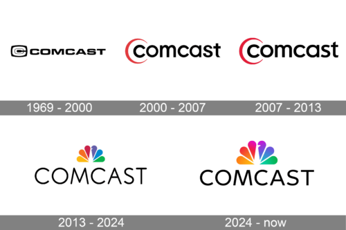
1969 – 2000
The very first logo, designed in 1969, was composed of a strict wordmark in all capitals and an emblem on the left. The inscription in black was executed in a strong sans-serif typeface, which is very similar to Microgramma Std Bold Extended.
As for the emblem, it was a stylized image of two letters “C”, placed one in another and located in a solid black square.
It was a strict yet very powerful logo, which stayed with the company for more than 30 years and was a brilliant reflection of professionalism and stability.
2000 – 2007
The first redesign of the company’s visual identity was held only in 2000, but it was a complete change of style. The inscription was now written in all the lowercase letters, using a slightly modified Futura font. As for the emblem, it was simplified and now features a stylized red lettering “C”, placed around the first letter of the wordmark.
The red and black color palette of the new visual identity was a symbol of power and passion, along with the professionalism and energy of the huge reputable company, which number one aim was to provide its customers with high-quality TV and Internet services.
2007 – 2012
The redesign of 2007 brought some minor changes to the logo, the only different thing in comparison to the previous version was a typeface if the wordmark. The letters became bolder now and were executed in a sans-serif typeface, very similar to URW Geometric Arabic SemiBold.
The emblem and color palette remained untouched. The new logo was strong and solid, evoking a sense of reliability and stability.
2013 – 2024
In 2012 Comcast buys 51% of NBC company and decides to adopt its famous colorful emblem. The stylized peacock was now placed above the wordmark in all capitals. The inscription is executed in a fine and elegant sans-serif typeface, which is most likely one of the Intervogue Family fonts. It looks light and modern, balancing the bright emblem and adding a sense of expertise and style.
As for the emblem, it is composed of six petals, each in one of the rainbow colors, forming a tail of the peacock, which is drawn in white.
The logo is still in use today and is a great representation of a powerful international company, showing its progressive and innovative approach and creative character.
2024 – Today
The new logo combines the colorful peacock emblem with the word “COMCAST” written below it. The peacock retains its vibrant gradient colors, symbolizing variety and richness in programming and content. Below, “COMCAST” is spelled out in a clean, sans-serif font, exuding professionalism and modernity. The black typography contrasts sharply with the colorful icon, ensuring clear readability and brand recognition. This logo communicates a balance of tradition through the NBC peacock and innovation through the simple, contemporary text, embodying Comcast’s role as a modern media conglomerate.
Colors
The petals are arranged in a rainbow color pattern. The NBC colors were meant to demonstrate the company’s relation to TV.
Font
The wordmark is written in a custom typerface, which combines serif and non-serif.
Who founded Comcast?
Comcast is an American company , which was founded in 1963 by Ralph J. Roberts, who was later joined by Julian A. Brodsky and Dan Aaron. Together the partners have been running the company for quite a long time.
What is the Xfinity logo?
The Xfinity logo is based on a clean minimalistic lettering with the name of the brand, set in a modern sans-serif font with distinctive contours and straight cuts of the bars. The lines of the “X” and the “Y” are elongated; which adds a sense of motion to the composition. The lettering can be seen in black or red, and is sometimes accompanied by the Comcast logotype.
Does Comcast have logo?
Yes, the Comcast company had its logo, and its first version was created in 1969, with a redesign in 2002, and its refinement in 2007. In 2012 the company was bought byNBCUniversal, hence its logo was redrawn to create a graphical affiliation to its mother company, with the famous NBC Peacock emblem being placed above the uppercase logotype.


