Telefonica Logo PNG
The logo of the Spanish company Telefónica has been updated around ten times before adopting its current look.
Meaning and history
Telefónica S.A. is a Spanish telecommunications company.
The company is one of the largest companies in the traditional and mobile cellular communications sector in the world, the fourth largest customer base in the world, and the sixth largest market capitalization.
The company was established at the beginning of the 1920s, almost forty years after the telephone appeared in Spain (1877). On August 25, 1924, a new royal decree authorized the government to create a national telephone company with monopoly rights, called Compañía Telefónica Nacional de España.
What is Telefonica?
Telefonica is the name of a Spanish telecommunications company, established in 1924 in Madrid. Operating globally, it is one of the largest fixed and mobile telecommunications companies in the world. Its main commercial brands are Movistar, active in Spain and Lyon America, O2 throughout Europe, and Vivo in Brazil.
1924 – 1984
Telefónica, S.A. is a telecommunications company based in Madrid, Spain. It was established in 1924 under the name of Compania Telefonica Nacional de Espana.
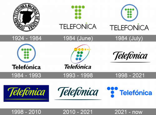
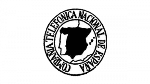
The earliest Telefonica logo featured the map of Spain depicted in such a way that it was somewhat reminiscent of a human face. The map was encircled by the full name of the company.
Also, in some periods, Telefonica used an emblem showcasing its interlacing initials inside a thin black ring.
1984 (June, July)
The era of “T”-logos made up of dots started. The first version featured a “T” made up of ten light green dots. The word “Telehonica” in an austere all-caps sans could be seen below.
1984 (July – November)
Very soon, the original “T” was placed inside a white ring with blue trim. The name of the company disappeared but was soon added once again.
1984 – 1993
The type featured in the word “Telefonica” was replaced by a slightly more elaborate one. The thickness of the glyphs slightly varied. Only the “T” was capitalized.
1993
A bright, bold vibe appeared. The dots forming the “T” were now colored in various colors. Their number grew from ten to twelve. The sizes of the dots forming the upper bar of the “T” varied from large to small.
Also, the glyph was italicized. The ring was replaced by a dynamic multicolor ellipse. There were also versions featuring a different palette.
1998 – 2010
In 1998, Telefonica introduced a new cursive font that was used heavily until 2021. Here, it took on a yellow color and was put against a dark blue rectangle.
1998 – 2021
The elegant script logo was adopted. Originally, the company name was light green on the dark blue background.
2010 – 2021
The company stopped selling its services under the name Telefonica replacing it by the Movistar, O2, and Vivo brands. The Telefonica logo was preserved as a corporate logo now featuring calmer colors.
2021 – now
A new font was adopted in 2021. They made it an upright sans-serif typeface with moderate boldness. They colored it darkish blue and put a new emblem to its left. It’s basically five blue dots composed into a ‘T’ shape.
Font and Color
The simple yet stable and modern title case lettering from the primary Telefonica logo is set in a clean geometric sans-serif typeface with distinctive contours of full-shaped letters. The closest fonts to the one, used in this insignia, are, probably, TT Hoves Pro DemiBold, or Pepi Semi Bold.
As for the color palette of Telefonica’s visual identity, it is based on a bright and vivid shade of blue, which Sparta from its main meanings — reliability, protection, and professionalism, — also evokes a sense of energy, motion, and progressiveness.


