

![]() Barney Logo PNG
Barney Logo PNG
Barney is the kids’ tv-show character, created in the USA in 1992. The purple Dino learns kids from 1 to 8 yo through funny songs and games. The tv-show is extremely popular across the globe.
Meaning and history
![]()
Barney is the name of the main character from the popular kids’ tv show Barney and Friends, which was first released in the United a stayed at the beginning of the 1990s. Barney is a plush tyrannosaurus, who is extremely helpful, funny, and friendly. The purple Dino helps kids from 1 to 8 years old learn new things about the world. The tv-show is available for kids in the United States and the United Kingdom.
What is Barney?
Barney is the name of the main character of one of the most popular American tv shows for kids, which debuted in 1992. The character is a purple dinosaur, who helps little boys and girls learn letters, numbers, and short funny songs. The tv show is available to watch in the United States and the United Kingdom.
1988 – 1991
![]()
The very first logo for Barney was created in 1988 and became a prototype for all the following versions. It was a bold handwritten inscription in dark pink, closer to purple, color, with uneven edges of the lines and full shapes on the letters. The wordmark was set in the title case and looked simple yet bright and playful.
1991 – Today
![]()
In 1991 the Barney logo was redesigned. The style of the lettering was kept, but it became black and got its lines emboldened, so started looking completely different — stronger and more modern. It was a more “serious” and professional version of the original insignia, which is still used by the brand today.
1992 – 2003
![]()
In 1992 the logo from 1991 gets color and volume. The letters of the handwritten “Barney” logotype now feature a delightful yellow shade and a thin black outline. The whole inscription has a black shadow, which makes it look more dynamic and energetic.
1996 – Today
![]()
The Barney logo is composed of two overlapping ovals, which are executed in purple and green, the colors the Barney Dinosaur has in his costume. The wordmark is placed on the purple one.
The free oval is located diagonally, more vertical, when the purple one is placed on it horizontally, making a perfect framing for the nameplate.
The oval shapes of the logo evoke a positive and kind feeling, showing the friendliness of the famous Dino and his willingness to help.
The wordmark in white is written in a custom sans redid typeface with rounded lines. It looks like it is hand-drawn which only adds playfulness and friendliness to the logo.
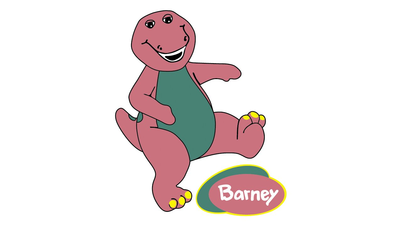
The Barney insignia is bright and happy, it is a good representation of the funny Dino hero. The logo is instantly recognizable due to the bright color palette.
The white lettering adds a sense of purity and kindness, showing the good intentions and educational approach of the tv-show.
Font and Color
The custom hand-drawn lettering from the primary Barney’s badge is set in the title case of a bold and funky sans-serif typeface. The closest fonts to the one, used in this insignia, are, probably, Fonteys Pro Black, or Minako Regular, but with some slight modifications of the characters.
As for the color palette of Barney’s visual identity, it is based on two intense colors, purple and green, with plain white used for the lettering. Purple is the color of mystery and imagination, while green brilliantly escalates these two qualities, adding a touch of growth and progress. White is here for better visibility and strong contrast.


