TechCrunch is an American web resource publishing articles and fresh news from the world of high technology and business. Their articles, researches, and news are targeted primarily towards IT specialists, businessmen, financiers and business analysts. TechCrunch is also known for its Disrupt and Startup Battlefield events, carried every year across a line of cities in US, Europe, and China. The website’s operations are managed in English, Chinese, French, and Japanese languages.
Meaning and history
The website was launched in 2005 by a technology entrepreneur, Keith Teare and editor Michael Arrington. Together, they started a project on highlighting the technology startups and innovations across the globe.
5 years after the foundation, the project was sold to AOL, and continued its development under the new brand logotype. By 2013, the website was published in English, Chinese, French, and Japanese.
Since 2014, TechCrunch has been hosting events, inviting the representatives of large companies and technology entrepreneurs. From 2015 to 2021, the resource was owned by Verizon Media. During this time, there was a management shift: the COO, Ned Desmond, left his place after 8 years of work. His job was later parted between Matthew Panzarino and Joey Hinson.
In 2021, Verizon sold the site to Apollo Global Management, which incorporated TechCrunch into a new structure named Yahoo.
What is TechCrunch?
TechCrunch is an American news website highlighting fintech, hightech and business events. They write articles about worldwide startups, inventions, and people. They carry their Disrupt and Startup Battlefield conferences, on which they discuss these three things, inviting worldwide persons in the dialogue. Their operations are managed in English, French, Chinese, and Japanese languages.
2005 – 2011
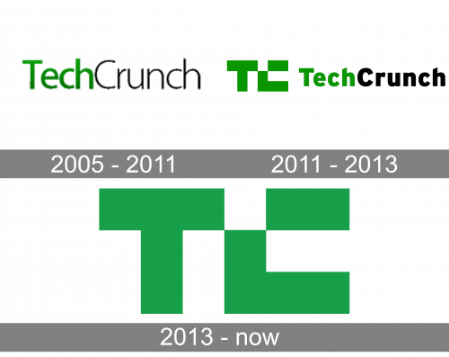
Following the foundation, the fist logotype was developed. It showed just the sans-serif nameplate without additional elements. The ‘tech’ part was green and bold, while the ‘crunch’ portion was thin and black.
2011 – 2013
Following the acquisition by AOL, the TC logo was modernized. The text caption became bolder, and it was now accompanied by an emblem. It pictured the ‘tc’ initials, written in an angular script. The ‘c’ didn’t have its upper left corner. They also had an only-emblem version with the letters executed in many green squares of various shades, reminding the pixels.
2013 – today
The latest logotype features just the signature with the initials made in a single color, not in blocks.
Color
The general color code of the TechCrunch brand identity consists of green and white shades as the main ones, as well as gray, blue, and black. In the logotype, the green covers letters, while the background is filled with white.
Font
The TechCrunch’s official typeface is Alright Sans. It is bold and angular. The letters in the emblem are sans-serif and uppercase.


