Syfy is the name of a famous American science-fiction tv-channel, which was established in 1992 as a Sci-Fi Channel. Today the property of NBCUniversal is very popular across the United States and has an audience of almost 100 million people.
Meaning and history
The popular cable TV channel SyFy was launched in September 1992 as the Sci-Fi Channel. The channel chose to specialize in sci-fi films and series. But soon the channel began to expand: it began to show projects related to all things fantasy and paranormal, mysticism and horror. In addition, reality shows of an entertainment nature became firmly established in the broadcasting network.
Due to a change in genre policy, as well as trademark registration, the name was changed to Syfy Universal
What is SyFy?
SyFy is a cable tv-channel, which was established in the United States in 1992 as a Science Fiction channel. Today the channel is owned by the NBCUniversal Television and Streaming company and is broadcasted nationwide; with all of its content in English.
1992 – 1999
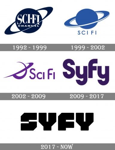
 The visual identity of the science-fiction tv-channel looks very futuristic and confident. Though the first versions, designed from 1992 to 2009, were all based on the image of a placed with a diagonal emblem, the channel changed its design concept after changing the name from “Sci Fi” to “Syfy”.
1999 – 2002

The redesign of 1999 made the SyFy logo simpler, but more modern and sleek. The contours of the place were refined and cleaned and the color palette was changed to blue and white, which represented reliability and professionalism. The wordmark was now placed under the emblem, written in the uppercase of a thin yet strong sans-serif typeface with traditional shapes of the letters.
2002 – 2009

In 2002 the SyFy logo was redrawn in a more progressive and even futuristic way. The new purple and white color palette only elevated the character of the redesign and made the emblem more recognizable and memorable. The Sci-Fi inscription in all capitals was now executed in a bold custom typeface with smooth lines and distinct cuts on the line’s ends. The emblem was set on the left from the lettering and boasted an abstract composition of two crossed lines, resembling the planetary motif in the previous logos.
2009 – 2017
 The first logo for the new name was created in 2009 and used the purple color of the previous version. It was a very simple wordmark in a title case, which was executed in a bold sans-serif typeface with smoothly arched tails of “Y” and rounded sides of “S” and “F”.
2017 – Today
The redesign of 2017 brought a new mood to the logo. It became powerful and sharp, reflecting the character of the channel and its audience.
The logo we all know today is composed of a black extra bold lettering in a custom sans-serif typeface with geometric silhouettes of the solid letters. The nameplate looks like nothing else, making anyone who looks at it picture space invasions or robots. It is absolutely futuristic and unique.
The new monochrome color palette only elevated the whole looks, adding a sense of professionalism and stability, showing the channel’s expertise and authority, and making it timeless and actual, wherever it is placed.
Font and Color
The heavy stylish lettering from the official badge of SyFy is set in an extra bold sans-serif designer typeface with brutal geometric characters. The stable inscription is set in a custom font, which has no commercial analogs.
As for the color palette of the SyFy visual identity, to balance the heaviness and uniqueness of the typeface, it is pretty simple. The solid black letters, set against a plain white background, look very confident and strong, evoking a sense of excellence and professionalism, and reflecting such qualities as stability, masculinity, and power.


