 Swedish Hockey League Logo PNG
The Swedish Hockey League (SHL) is a professional ice hockey league in Sweden. It is owned by the Swedish Ice Hockey Association and operates as the top-tier hockey league in the country. The SHL features teams from various cities in Sweden, showcasing top-level hockey talent and providing exciting competition for fans.
Meaning and history
The Swedish Hockey League (SHL) was founded in 1922 by the Swedish Ice Hockey Association. It is the top professional ice hockey league in Sweden and consists of 14 teams. The league has seen tremendous success over the years, with many teams and players achieving notable accomplishments. The SHL has produced numerous NHL players and has a strong reputation for developing talent. Currently, the league is regarded as one of the top hockey leagues in Europe and continues to attract a large fan base, maintaining its position as the premier ice hockey league in Sweden.
What is Swedish Hockey League?
The Swedish Hockey League (SHL) is a professional ice hockey league in Sweden. It is the top-tier league in the country and features teams from various cities competing for the national championship.
2001 – 2012

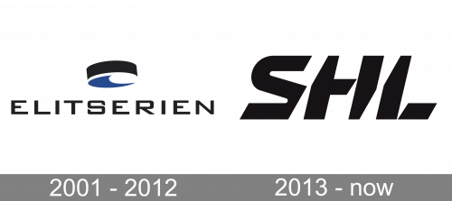
We should also mention the old SHL logo, which was used before 2013. At the time, the league was called Elitserien, which was reflected in its visual brand identity. Here, the word “Elitserien” was given in a geometric sans serif typeface. The glyphs were based on a square shape. Above the lettering, right in the middle, a small black puck with a dark blue bottom could be seen.
2013 – Today

In spite of their unusual shape, the letters of the Swedish Hockey League logo are quite legible. What makes them unique is the way they appear to be cut from the sides. This approach adds some motion to the otherwise static logo.


