

![]() Supernatural Logo PNG
Supernatural Logo PNG
The American fantasy horror television series Supernatural, which was created by Eric Kripke, has had a distinctive wordmark since it was first broadcast in 2005. In addition to it, the movie featured several symbols, with a slightly different meaning than they typically have in occultism.
Meaning and history
![]()
The original Supernatural logo, which was introduced in 2005, featured quite a regular typeface. Although it was an all-cap font, the first letter was a bit higher than others.
![]() All the following wordmarks looked much more sinister due to the choice of color and unusual visual effects. For instance, the Season Two wordmark was given in “fiery” letters, the Season Three logo had an effect of a lightning bolt, the Season Four emblem looked “bloody”, while the Season Seven letters resembled black blood.
All the following wordmarks looked much more sinister due to the choice of color and unusual visual effects. For instance, the Season Two wordmark was given in “fiery” letters, the Season Three logo had an effect of a lightning bolt, the Season Four emblem looked “bloody”, while the Season Seven letters resembled black blood.
Season 1
The badge, created for the first season of Supernatural, featured a three-dimensional uppercase lettering in a very elegant and sophisticated serif font, with the capital characters drawn in light-blue gradients, and placed against a plain black background.
Season 2
For the Season 2 the logo was redrawn. Now the “Supernatural” wordmark was executed in orange-to-yellow gradients, with a flame pattern, blurred contours and stylized elongated lines. The letter “A” in the lettering was replaced by a contoured five-pointed star.
Season 3
The lettering, used in the third season of the tv-show, was set in cold blue and silver gradients, with the uppercase inscription set in a bold and classy serif font, but with blurred contours, and thin transparent elongated lines coming out of the letters vertically, like shining. The background has a cold blue mountain landscape with a futuristic cosmic mood.
Season 4
For the fourth season of Supernatural the uppercase serif lettering turned red, with transpired red lines coming out of the characters’ contours vertically. The red lettering was written against a plain black background, making up a very dramatic composition.
Season 5
For Season 5 the logo was rethought again. This time the inscription was set in plain black lines, with the contours of the characters looking very sophisticated. The black inscription was written against a pinkish background with an interesting patters, resembling plastic or a tulle fabric on the wind.
Season 6
The logo, created for the sixth season of the Supernatural tv-show, was executed in a blue and black color palette, with the shining gradient blue letters slightly blurred, creating a magical feeling.
Season 7
For the seventh season of the tv-show the silverish black dripping inscription was placed on a light background with some gradients, adding volume to the composition and creating a sense of motion.
Season 8
A new color palette was adopted for the badge in the eighth season of Supernatural. The blurry three-dimensional lettering was set in smooth shades of fire, while the background got copper tones and some additional decorative elements in the same color scheme.
Season 9
For Season 9 the lettering got glossy and surrounded by light, viking from behind it, the center of the background with a hazy mountain landscape in white and beige shades with dark gray and brown accents.
Season 10
The logo of the Season 10 depicted a shiny blue lettering on a black background with the recognizable symbol with a five-pointed star inscribed into a circle, drawn in the same shade of blue, with internal shining.
Season 11
The badge, created for the 11th season was very minimalistic and elegant. The three-dimensional uppercase wordmark was set in a glossy metallic texture with smooth copper shades, and placed against a gradient gray background with the lighter center and darker borders.
Season 12
For Season 12 the concept of the 10th season logo was redrawn in a new color palette, with all blue elements replaced by the flame shades, and the cold black background — by a slightly brownish and dramatic one.
Season 13
The Star from the previous badge was replaced by the roundel with lots of thin shiny threads coming from the perimeter to the center. The lettering got more distinctive and the shades of the logo — brighter and warmer.
Season 14
For Season 14 the logo was redrawn in a gradient blue color palette, with the blurred shiny lettering set on a background with a mythological bird, flying forward and having its huge wings spread to the sides.
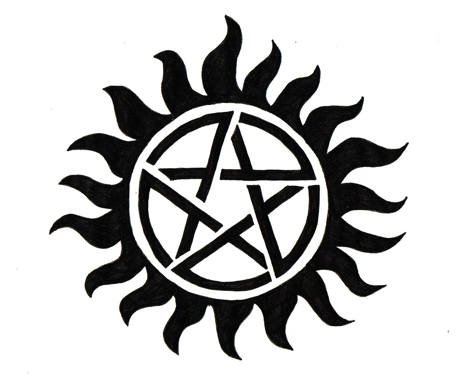
Pentagram symbol
Both the heroes, Sam and Dean, have a Protection Tattoo depicting a pentagram. One of the most well-known occult symbols, pentagram, is most often used to convey the idea of five elements. However, in the Supernatural series the pentagram has a different meaning. The tattoo is one of the ways to protect Sam and Dean from evil forces: it does not let demons possess their bodies.
Aquarian Star emblem
The unicursal hexagram, which was developed by the 19th century Hermentic Order of the Golden Dawn, typically symbolizes the union of opposites. However, in the movie it is used as an emblem of a secret society called the Men of Letters.
Font
![]()
Arguably, the most unusual feature of the Supernatural symbol is that the wordmark has a downward direction. The letter “R” has a longer right end pointing down, while the “A” and the “L” are positioned a bit lower in the line. Possibly, the design team was trying to convey the idea of moving down, to the world of the dark forces.
Color
![]()
The Supernatural logo has gone through various color palettes, aiming to create a sinister impression.


