Stoopid Monkey is an animation and production studio, which was established in 2005 in the United States. The studio is most known for the production of several adult cartoons for the Adult Swim program.
Meaning and history
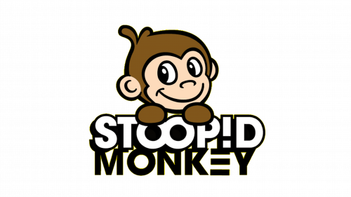
The Stoopid Monkey visual identity has undergone two major redesigns throughout its history. The original brand’s visual identity was composed of a colorful monkey image with a playful graffiti-style wordmark, where the “I” was stylized as “!”.
The white lettering in a thick black outline was usually placed on a bright background and the monkey in different scenarios was always the main part of the logo.
2005 – 2009

The initial Stoopid Monkey logo, introduced in 2005, was the only version without any graphical representation of the name — no monkey portrait! The logo was composed of a black and white handwritten inscription with bold jumping capitals in a double black and white outline. The thick lines and solid shapes of the symbols made the logo look progressive and powerful, and their playfulness emphasized the character and purpose of the studio.
2008 – 2009
Since 2009 Stoopid Monkey started using a simplified version of the logo. It was composed of a wordmark with a contoured monkey head above it.
All capital letters of the nameplate were executed in a bold sans-serif typeface, where the “I” was still written as “!” and two “O”s of “Stoopid” connected, resembling an eternity sign. The silver-gray gradient color of the wordmark and emblem looked sleek on a dark blue background.
The latest redesign of 2014 kept the two unique elements of the previous logo — the “!” and the “double O”. But the style of the logo was changed dramatically.
The lettering now is extra bold, drawn in gradient yellow with a black outline. Letter “E” is written using only three horizontal bars. The background also changed its color to a “more monkey” brown.
2009 – Today
The Stoopid Monkey logo is bright and has good contrast and balance. It is playful and recognizable, yet pretty minimalist.


