The Sun is a British daily tabloid newspaper, founded in 1964. It was aimed to be a broadsheet, but became a tabloid in 1969 after it was purchased by its current owners, Rupert Murdoch’s News International.
Meaning and history
The Sun is one of the most recognizable and controversial brands in international media.
The tabloid’s logo has taken no changes for quite a long time. It is bright, due to its red and white color palette, bold, due to its Franklin Gothic Heavy Italicized typeface, and provocative, which fully reflects The Sun as a brand.
Being the most-circulated newspaper in the U.K., The Sun has to have a very bright yet simple logo, as it’s first page always contains a lot of headlines and photographs, the logo has to stand out on any background.
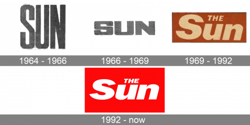
1964 – 1966

The initial logo was a simple wordmark made from grey letters. They were tall, narrow and used a basic sans-serif font.
1966 – 1969

In 1966, they decided to squeeze the previous design, making it wide and short. That’s about all they’ve done.
1969 – 1992

The 1969 emblem was more unique. They now used lowercase, as well as uppercase ones. The letters themselves were switched to white and tilted to the right. Apart from the old stuff, there was also a new ‘the’ article written in all capital letters, by in a reduced size. All of that was usually put onto an orange rectangle for background.
1992 – now

Several changes were introduced in 1922. For one, orange was swapped for bright red. Secondly, they made the letters visibly wider compared to the previous design.


