Staybridge Suites is a residential-style brand of hotels, founded in 1997 and operating 245 hotels across the Americas, Europe and the Middle East. It is a part of InterContinentalHotels Group.
Meaning and history
1997 – 2004

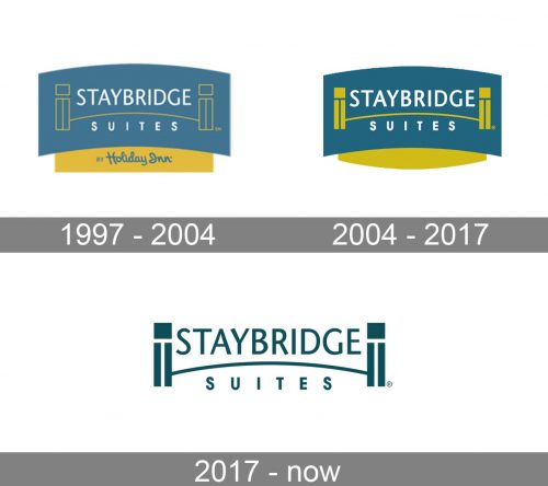
The base of their original design is a light blue rectangle, curved upside. There’s also a square yellow extension growing from the bottom with the parent company’s name on it, but much of the logo is located above. There, they drew a minimalistic yellow bridge out of several lines and wrote the brand’s name in white letters on each side of this image (above & below). Naturally, the main word is bigger, but the style is the same.
2004 – 2017

In 2004, they filled portions of the bridge image that were hollow with yellow. The letters became bolder, the colors brighter, and the ‘by Holiday Inn’ wordmark below disappeared.
2017 – Today
The Staybridge Suits logo color palette includes sea blue, light gold and white.
The logo itself is quite classic and elegant, featuring the wordmark in sophisticated serifs and a image of architectural elements.
The image part includes columns and a bridge between them. The bridge horizontally divides the wordmark into two parts and represents the name of the brand.
The Staybridge Suits logo represents the brand’s authenticity approach to service and hospitality, while offering their guests all the modern amenities and design solutions.


