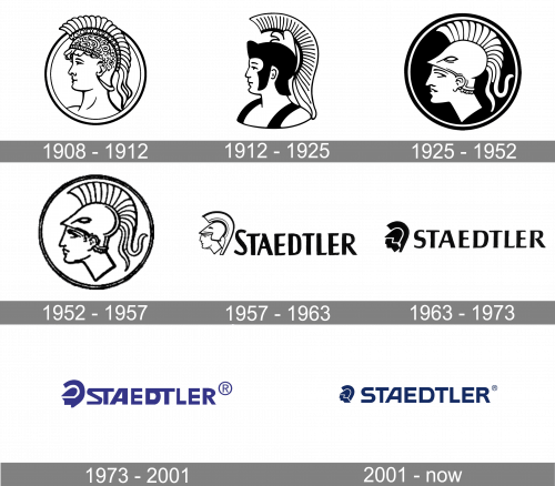
Staedtler is a German brand of stationery products manufacturer, which was founded in 1935. The brand is famous for its art materials, such as color paint and pencils. The brand sells its supplies all over the globe.
Meaning and history
The history of the Staedtler brand goes back to 1835 when Johan Sebastian Staedtler founded his own pencil factory. It was a tribute to his roots and family, as one of his ancestors, Friedrich Staedtler, actively traded in pencils in 1662.
Staedtler is one of the oldest industrial companies in Germany and the inscription “Made in Germany”, which can be seen on every company product, became an integral part of the brand symbolizing quality and loyalty to tradition.
Staedtler’s many years of experience and considerable advancement in development enable it to create products of high quality. Staedtler’s research and development department constantly monitors demand and updates the company’s product range with innovative products.
The company’s value number one is Quality. This can be noticed even in the erasers of the brand. Erasers have been produced by Staedtler for more than 40 years. All models are individually wrapped in polyethylene. The principal position of Staedtlerin the manufacture of erasers is the refusal to use natural rubber because, firstly, developed by the company and patented composition of erasers in several characteristics exceeds the quality of erasers made of natural rubber, and secondly, natural rubber contains latex which can cause allergic reactions.
What is Staedtler?
Staedtler is a world-renowned German company that has been making stationery, and products for artists and engineers since the middle of the 19th century. Today the brand manufactures a wide range of stationery products, which are distributed internationally. Staedtler is also one of the oldest industrial companies in Germany.
1908 – 1912
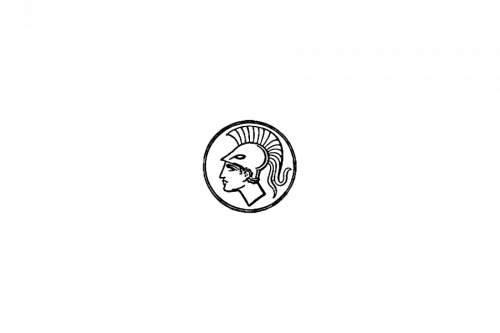
The very first logo of the Staedtler brand was introduced at the beginning of the 20th century and featured an image of the Roman god of war, Mars. Later this image will be redrawn several times, but will always be present on the Staedtler logo, and will even get the name “The Head of Mars”. The original badge was drawn in thin black lines over a white background.
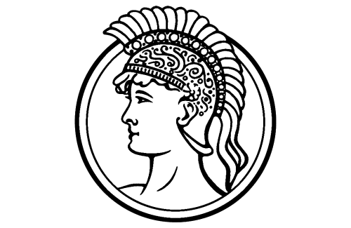
1912 – 1925
The redesign of 1912 has removed a circular outline of the logo, and redrawn the Head of Mars more confidently, with thicker lines and sore elements colored in solid black. This badge has stayed in use by the German company for more than a decade
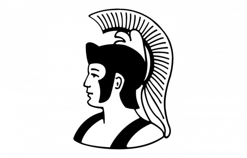
1925 – 1952
In 1925 the circular framing comes back to the Staedtler logo, with the Head of Mars redrawn in a more modern and abstract way, in white, with thin black lines for accents. The portrait was placed on a solid black background, with the framing executed in two lines — white and black. This depiction of Mars has become a basis for all future redesigns of the brand’s visual identity.
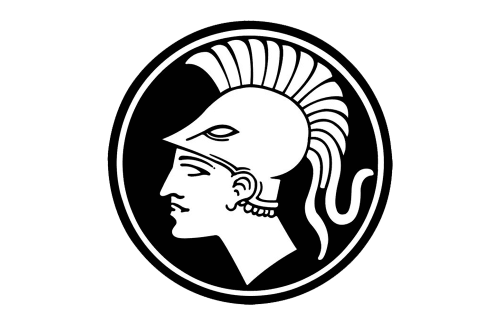
1952 – 1957
The Staedtler logo was refined again in 1952, with the profile of the Roman god of war contoured in bolder black lines, and placed on a white background, in the center of the circular badge with thick black framing. There was still no lettering on the official version of the brand’s logo.
1957 – 1963
The first badge with an inscription was introduced by Staedtler in 1957 and stayed untouched for six years. It was a black-and-white composition with the clean and modern image of the Mars Head, set on the left from the narrowed uppercase logotype, without any frames or outlines. The inscription had its first letter enlarged and was executed in a heavy sans-serif font with tall condensed characters.
1963 – 1973
The redesign of 1963 changed the emblem to a more modern one and the font — to a more stable and geometric one. The graphical part of the badge was now formed by three solid black fragments, separated from each other by thin white lines. As for the logotype, it got a stronger sans-serif font, with straight lines and wide shapes of the capital letters. All characters feature the same size.
1973 – 2001
In 1973 the Staedtler badge got a new color palette. Now both elements of the logo were set in a deep and bright shade of blue. The emblem was refined, getting some lines smoother and longer. As for the inscription, it became bolder and more stable, with both letters “T” having their horizontal bars elongated and merging with the letters standing on their left.
2001 – Today
The Staedtler logo is composed of a strict geometric wordmark and a famous brand’s emblem.
The emblem is a Head of Mars (the full company’s name is Staedtler Mars GmbH), which was originally created in 1958 and slightly changed during the brand’s history. It symbolizes brand’s reliability, innovative creation and precision.
The intense blue color palette of the logo shows the brand as professional and evokes the sense of trust, comfort and stability.
Staedtler is a brand with rich heritage, yet open to progress and movement. The Staedtler logo is a unique quality mark, which is associated with the best writing instruments ever created.
Font and color
The strong geometric uppercase lettering from the primary badge of Staedtler looks very stable and modern. It is executed in a custom sans-serif font; with the letters slightly extended and the lines straight and distinctive. The closest fonts to the one, used for the Staedtler visual identity, are Hanley Pro Sans Wide Extra and Gunterz Medium, but with the contours of some letters modified.


