DAIKIN is the brand name of Daikin Industries Ltd., a Japanese corporation founded in 1924, a world leader in the manufacture of household and industrial air conditioners, heating and ventilation systems. It was originally called Osaka Kinzoku Kougyou, and in 1963 it was renamed Daikin Industries Ltd.
Meaning and history
Daikin is a Japanese company, a world leader in the production of residential and industrial air conditioners, heating, and ventilation systems. It has production facilities in Japan, China, Australia, India, Southeast Asia, Europe, and North America. The company is rightfully considered a world-class innovator in the development of air conditioning equipment. The company was established in 1924 and was originally called Osaka Kinzoku Kougyou. It changed its name to Daikin Industries Ltd only in 1963.
Daikin is a unique company, as it is the only manufacturer, 95% of the capacity of which is engaged in the production of only climate technology. The company has the most extensive range of air conditioners, which makes it possible to find the optimal solution for objects of any complexity.
The range of Daikin products includes air-cooled and water-cooled chillers, packaged air conditioners, split and multi-split systems, Sky Air systems, and VRV systems with cooling, heating, and heat recovery capabilities.
What is Daikin?
Daikin is the name of a Japanese company, engaged in the production of air conditioners and ventilation systems. The company was founded in 1924, and since its first days was focused on air conditioning solutions. Today Daikin is one of the world’s most reputable companies in its segment.
1934 – 2004
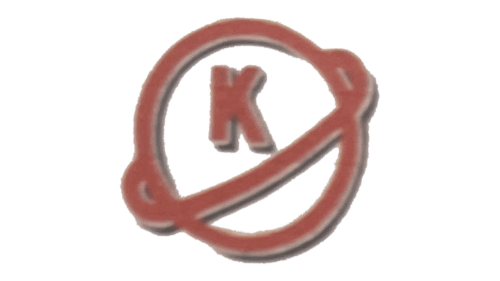
The original logo of the Japanese air conditioner manufacturer was executed in a dark and blurred red color palette, with just one letter inscribed into a graphical element. It was a globe, depicted as a contoured circle in a thick red outline and thin gray lines around, with the orbit, diagonally set around it, in a line of the same thickness and color. The upper part of the globe contained the capital letter “K”, written in the same style.
2004 – Today
 The current Daikin logo has at least two versions. One of them is dominated by the lettering “Daikin,” while on the other, the pictorial part takes up the majority of the space.
Let’s start with the first version, which can be seen on the company’s official website. Here, the word “Daikin” is larger than the triangle. The type is dynamic due to the italics. And yet, the letters are pretty bold, which adds some weight. The light blue color conjures up the sky and fresh air, which is an excellent association for an HVAC manufacturer.
The pictorial part of the emblem can be seen to the left. It features a triangle with the black top and light blue bottom.
In the second version, the triangle is larger than the lettering. The triangle occupies the central part of the design, while the word “Daikin” in smaller glyphs can be seen above.
Font and color
The bold italicized logotype from the Daikin primary badge is written in the uppercase of a massive and brutal sans-serif font with sharp angles and straight cuts of the letters’ bars. The closest typefaces to the one, used in this insignia are Univers 93 Extra Black Extended Oblique and Nuber Next Black Extended Italic.
As for the color palette of the Daikin visual identity, it is composed of black and two shades of sky-blue, the hues, which evoke a sense of freshness and represent the cool clean air, that the products of the brand provide their customers with.


