Ericsson is a Scandinavian brand of hardware and software services for telecommunication technologies providing company. It was founded in 1976 in Sweden, by Lars Magnus Ericsson and his wife Hilda, and the trademark was registered in 1894.
Meaning and history
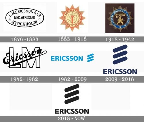
The visual identity of one of the European oldest telecommunication companies has a pretty rich history, which started at the end of the 19th century, and brilliantly reflects the progress and growth of the brand, showing its ability to change to provide their customers with the latest technologies and high-class design in the label’s products.
1876 — 1883
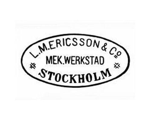
The very first logo was created for the company when its name was LM Ericsson and featured a horizontally oval medallion with three levels of lettering. The “L.M. Ericsson & Co” was arched along the upper line of the emblem, written in a lightweight sans-serif, while the bottom part of the badge comprised a bold serif “Stockholm” inscription. The “Mek. Werkstad” was placed in the middle, in a condensed sans-serif.
1883 — 1918
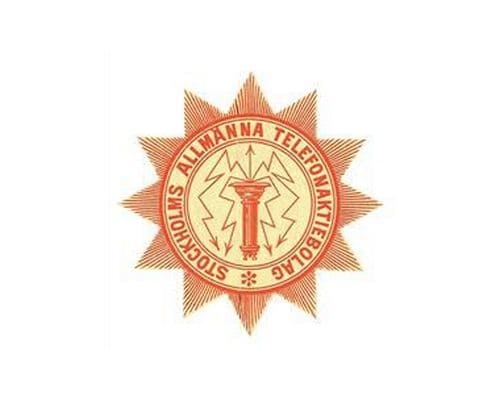
The bright and ornate badge was adopted by the company in 1883 and stayed with it for more than thirty years. It was a rounded emblem enclosed in a frame with 12 triangles, which made the whole badge look like 12-pointed Star. The circle featured a double red outline, where the bold capitalized “Stockholms Allmanna Telefonaktiebolag” wordmark was written around the perimeter. In the middle of the composition, there was an image of a red mechanism with several zig-zag lines and arrows on their ends.
1918 — 1942
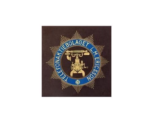
The redesign of 1918 kept the main shape of the badge but changed everything else. The color palette was switched to gold, blue and brown, and the inscription, which was now written in a lightweight font, was now composed of “Telefonaktiebolaget L. M. Ericsson” letters. In the middle of the badge, there was a golden image of a phone, which was drawn very detailed and looked sleek and professional.
1942 — 1982
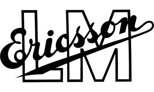
In 1942 a contemporary and laconic badge was introduced: a diagonally placed “Ericsson” in a script font with a sleek pointed underline was placed over a bold sans-serif “LM”, which was drawn in white and had a thin black outline.
1982 — 2009
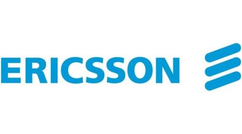
The name of the company was changed to Ericsson in 1982 and a modern era for the brand’s logo started in the same year. The logo, created in the 1980s featured a bold light blue inscription in all capitals, executed in a clean traditional sans-serif typeface, and an emblem in the same color, placed in the right from the wordmark. The emblem was composed of three parallel lines, placed diagonally and having their ends rounded. The three lines were a graphical representation of the brand’s name and its first letter, “E”.
2009 — 2018
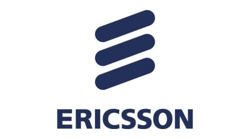
The redesign of 2009 enlarged the emblem and placed it above the lettering. The bright blue was changed to a darker shade, which gave the whole logo a more confident and professional look.
2018 — Today
In 2018 the logo started being executed in a monochrome palette. The composition remained unchanged, through both the emblem and the lettering were refined and modified. The lines of the stylized “E” now have a bit more space between each other and the angle of their inclination was changed, in comparison to the previous version. As for the logotype, it still uses a strict and laconic sans-serif, but with more elegant lines and wider shapes.


