The Village, a vibrant media outlet, stands as a testament to contemporary Russian journalism, founded by Philipp Dzyadko. This platform is dedicated to urban issues, cultural events, and lifestyle trends, focusing primarily on the younger, urban demographic. Its operations span across major Russian cities, including Moscow and Saint Petersburg, where it has established a robust presence. The Village has carved out a niche in the Russian media landscape by offering in-depth coverage of city life, cultural phenomena, and social issues, resonating with a modern audience that seeks a fresh perspective on urban living.
Meaning and history
The inception of The Village dates back to 2010, a brainchild of Philipp Dzyadko, who sought to create a media platform that resonates with urban dwellers and their unique lifestyle. This initiative rapidly morphed into a pivotal source of information for Russia’s city-centric population, particularly appealing to the younger, internet-savvy crowd. Over the years, The Village has achieved significant milestones, including expansive coverage of urban culture, influential reporting on local issues, and becoming a go-to source for contemporary lifestyle content. The platform has notably contributed to the discourse on urban development and cultural trends within Russia.
In recent times, The Village has maintained its stronghold as a prominent media entity, continually adapting to the evolving digital landscape. It has successfully harnessed the power of social media and online platforms, ensuring its content is both accessible and relevant to its audience. The Village’s current position as a trusted source of urban and cultural news illustrates its successful adaptation to the changing media consumption habits while steadfastly upholding its commitment to quality journalism and insightful reporting on Russia’s urban life.
What is The Village?
It’s a dynamic Russian media platform, deeply embedded in urban culture and lifestyle. Its content, tailored for the youthful, city-dwelling audience, blends journalism with a keen focus on the modern urban experience.
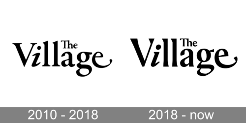
2010 – 2018
The logo depicts the phrase “The Village” in an elegant serif font that marries tradition with a touch of modernity. The smaller, capitalized “The” sits atop “Village,” implying a titular significance to the name. The typographic choice here is interesting—the “i” in “Village” is replaced with a stylized figure that resembles the numeral “1,” hinting at uniqueness or a sense of being at the forefront in its category. This design choice adds a contemporary flair to the otherwise classic typography, making the logo memorable.
2018 – Today
The Village logo is a great example of using font as art object. It looks sharp and modern in its color minimalism. The logo is a black wordmark on a white background.
The designers played types as images in order to create a bold visual language of the logo. It’s main sans serif font is complimented by two graphic letters — I and E. They add playfulness and at the same time confidence to the typeface.
Letter E with has an elongated tip, which end forms a point, resembles a smile. Letter I in italics dilutes strict lines of V and L.
The Village logo is bold and contemporary in its elegance and simplicity.


