The Independent is a British newspaper which was founded in 1986 as a broadsheet and changed to tabloid format in 2003. In 2016 The Independent shifted to a digital-only model. It is a politically independent newspaper.
Meaning and history
When the founders of the paper were taking a decision to start a new newspaper in 1986, a variety of names were considered. They needed a title which would reflect the values, ethos and journalism of the new venture, to attract readers and command loyalty, respect and support. The Independent did so.
And it inspired one of the most famous and successful marketing campaigns in media history, with the slogan: “It is. Are you?”
The Independent logo is one of the world’s most recognizable media icons. White eagle holding a newspaper on the red background, the official brand’s logo since 1986, is the work of Matt Willey.
Eagles symbolize awareness, the ability to see from a vantage point that is reserved for a very few.
1986 – 2005
The original 1986 logo looked like a classic newspaper header. There, they put the paper’s name in big, serif letters. They were mostly black, although there were some white lines on the inside of these letters here and there. There was also an emblem, usually on the left from the wordmark, which was an image of an eagle bearing a newspaper in its claws.
2005 – 2010
The 2005 logo uses the same font as its predecessor, although the design is also not identical. The ‘The’ part was reduced in size and moved to the position above the first two letters of ‘Independent’. To its right, they put the usual eagle emblem, but this time they colored it red.
2010 – 2011
In 2010, the coloring was reversed: red letters, black eagle. Other than that, the letters themselves became slimmer.
2011 – 2013
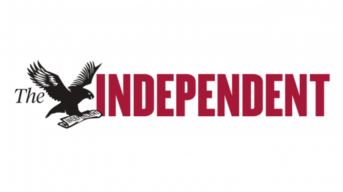
The 2011 logo rearranged all the pieces. They were now in a single line; from left to right: a much smaller black ‘The’ written with a cursive font, a black-and-white eagle emblem with more nuance and resolution & the word ‘Independent’. The latter consisted of tall red letters. The font was a blocky sans-serif this time.
2013 – now
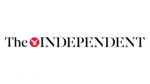
They retained the positioning for the 2013 logo. That being said, the written parts reverted to the old strict, thin font. The part with an article used lowercase letters, but the ‘Independent’ was completely uppercase. The emblem was also reduced to a white silhouette of an eagle in the middle of a small red circle.


