

![]() Square Logo PNG
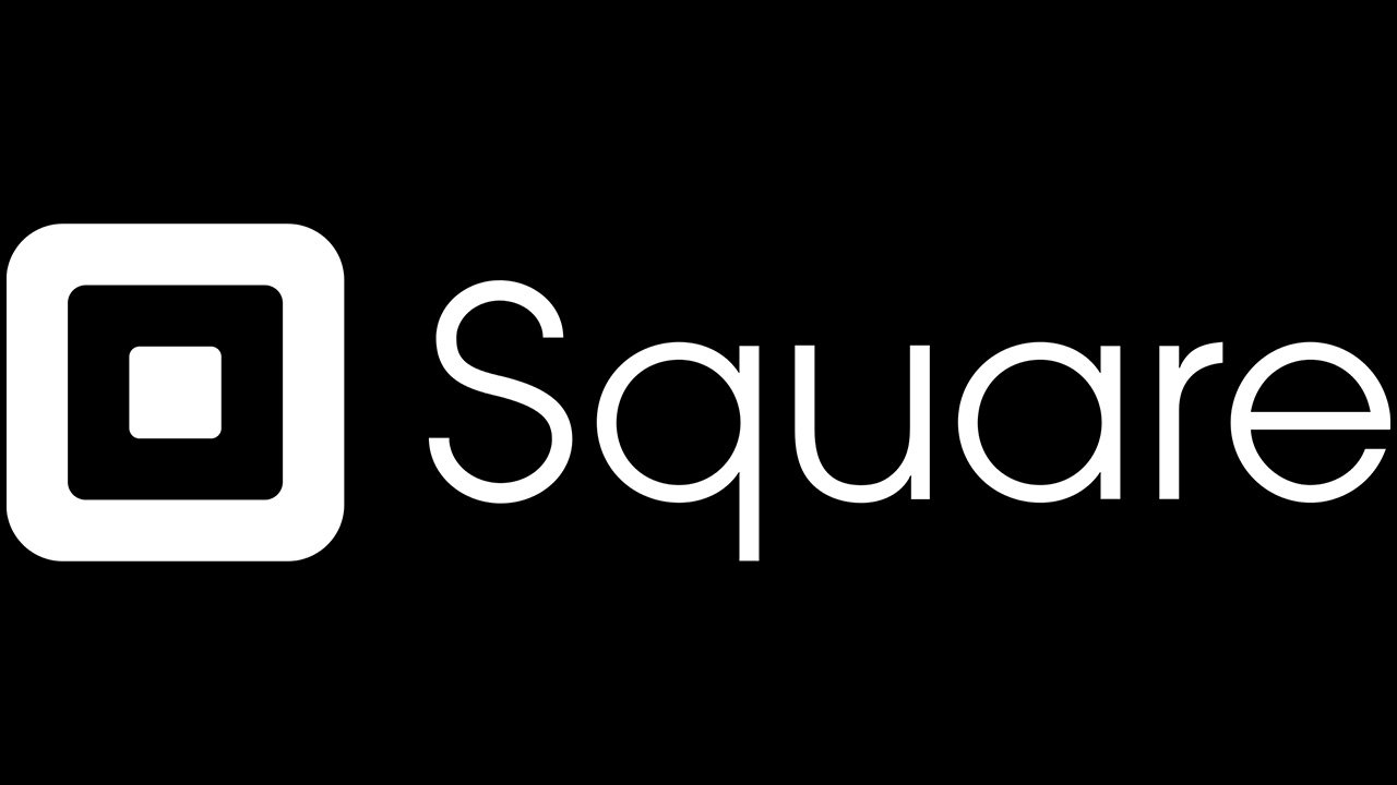
Square Logo PNG
Although the Square logo appears to have been the first, most people seeing it for the first time will instantly think: “That does look like Instagram!”
Meaning and history
![]()
The San-Francisco-based company Square, Inc. was established in 2009 and unveiled its first app the following year. Apart from working as a financial services and merchant services aggregator, it is also a mobile payment company.
2009 – 2011
![]()
The original Square logo was a green cube with two squares (white and green) on one of its sides.
2011 – 2016
![]()
The essence of the previous logo was preserved, but the current one looks sleeker and more informative due to the highly legible wordmark.
2016 – Today
![]()
In 2016, they rearranged the elements, so that the name bit is now below the square. What’s more, both are now colored a dark shade of grey without any other colors.
Symbol
The logo consists of a pictorial emblem (three overlapping squares) and the company name, which can be given either below or to the right.
Square emblem and Instagram
Probably the first thing coming to mind when you see the Square logo is that it looks like a modified version of the Instagram logo.
Both are based on a square with rounded corners. Both can be broken down into the three parts: a large outer square, a smaller square inside, and one more shape in the middle. In the case of Instagram, the shape in the center is a circle, while in the case of Square it’s, of course, a square. However, as this shape is the smallest, it doesn’t catch your eye, so you can overlook the difference. You may also notice the small white dot in the top right corner of the Instagram icon.
A more important distinction is probably the color scheme. Also, while the Instagram icon is so recognizable it doesn’t even need the name of the brand to be written next to it, Square can’t boast this level of popularity. That’s why it needs the text to be recognized.
Now, the most interesting question arises – which of the two was the first. Instagram unveiled the new icon in the company blog on May 11, 2016. The current (black-and-white) version of the Square emblem was downloaded on the Brands of the World website on April 12, 2016. Prior to it, the grey-and-white version of the same shape had been used. Moreover, if you happen to remember the way the emblem looked in 2010, you’ll agree that it was pretty close to its current shape (much closer than the original Instagram logo, which debuted the same year).
Font
The sleek sans serif type has a modern and technological feel without losing its friendliness. The ellipse-based letters balance the square logo perfectly. You may find a couple of pretty similar typefaces (Seconda Soft Light published by Durotype and Rutan Regular by The Northern Block), yet none of them is an exact copy.
The glyphs on the old logo weren’t the same. They were based on the circle shape, while the “a” had a different structure.
Colors
![]()
The previous logo dominated by light grey was replaced by the black-and-white version, which provided better contrast and visibility.


