SpiceJet is a budget carrier headquartered in Gurgaon, Haryana, India. The roots of SpiceJet go back to 1984, when S. K. Modi, an entrepreneur from India, created MG Express. This company specialized in private air taxi services. When in 1993 MG Express started to collaborate with Lufthansa, it adopted a new name, Modiluft. Unfortunately, only three years later, the carrier ceased to exist.
Meaning and history
Dynamic and vivid, the SpiceJet logo alludes to the company name and also creates an uplifting and youthful mood.
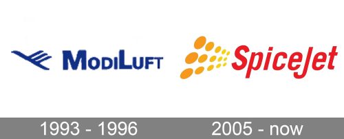
1993 – 1996 (ModiLuft)
To better understand the logo of SpiceJet, it might be interesting to compare it to the visual brand identity of its predecessor.
The logo of Modiluft was a combination of the name of the brand with a stylized bird. That’s one of the recurrent motifs in logotypes of airline companies. The bird here symbolized the aircraft. Even the way the bird is depicted makes it look similar to an aircraft.
The design was executed in calm and mysterious dark blue, which resembled the colors of the night sky.
2005 – present (SpiceJet)
The palette of the SpiceJet logo is in stark contrast with that of its predecessor. We can see the vibrant red of the wordmark paired with the yellow and orange emblem. Apparently, these colors are supposed to represent the colors of some of the most popular Indian spices, for instance, turmeric, saffron, and red chili.
What is SpiceJet
SpiceJet is among India’s three largest airline carriers in terms of the number of passengers carried locally. The company has a fleet of around 120 aircraft and flies to about 65 destinations.
The elongated, thin shape of the letters makes them somewhat reminiscent of a red chili pod, while the orange emblem may be interpreted as spices thrown in the air.
There is also another obvious interpretation: the red part of the logo represents an aircraft, while the orange part represents the exhaust fumes. This explanation perfectly fits as it gives us a link to the industry in which the company works. In comparison with the logo of ModiLuft based on the generic aircraft-bird simile, it looks more unique. This contributes to a memorable, recognizable logo.
Additionally, the orange ellipsoids are similar to the sun. On the one hand, this is another way to refer to flying as the sun plays a key part in the “skyscape.” It might be understood as a reference to the Sun Group. But this was probably an unintentional one, as the Group only purchased a stake in the brand in 2010.
Colors and font
The main reason behind using this palette was probably that the designers wanted to allude to the colors of spices. Moreover, both orange/yellow and red contribute to a certain mood. Yellow, on the subliminal level, connotes youthfulness and optimism. This can be a valuable symbol as low-cost carriers often see the young as their target audience.
Red, in its turn, is the color of activeness and energy. It may imply the speed with which you will be taken to your destination.
Another way to symbolize speed in the SpiceJet logo is the italicized typeface. Tilted letters look more dynamic than straight ones, and they imply motion.


