 Pan American World Airways Logo PNG
Pan American World Airways was America’s main and largest international air carrier from 1927 to 1991. It was an unofficial flag carrier of the US. Pan Am had to file for bankruptcy in 1991.
Meaning and history
Pan Am was founded in 1927 as a mail carrier between Florida and Cuba. But 20 years later, thanks to competent management and the lobby in power, it became the main airline in the United States. It was Pan Am that was the first to have wide-body planes. Moreover, the company began to fly internationally and was the first air carrier to do different classes of flights.However, having become a pioneer, the company could not continue to exist in the face of change, and in 1991 it was closed.
The legendary airline was founded on March 14, 1927, by a group of military pilots under the name Pan American Airways.On 16 July 1927, it was awarded a US Post Office contract FAM 4 to carry mail from Florida to Havana, the capital of Cuba, with a condition that it begin operating on 19 October 1927. However, the founders were never able to realize this opportunity. It would have ended in failure if it had not been for a young businessman, Juan Tripp, who bought Pan American Airways in1927.
In the 1930s, Pan Am took a swing at intercontinental flights. Immediately it became clear that such a task required an upgrade of the fleet. Postal flights across the Pacific began with the Sikorsky S-42, but in 1936 with great pomp was presented the Martin M-130, and in 1939 – the Boeing-314. With them Pan Am opened air passenger service to Southeast Asia.
Pan Am’s fame and financial prosperity peaked in the 1960s. In 1966 the airline carried 6.7 million passengers.
In December 1988, Pan Am Flight 103 London-New York was blown up over Lockerbie, Scotland. All those on board were killed, as well as 11 people on the ground. The tragedy exacerbated the financial problems of the airline, which owed the relatives of the victims hundreds of millions of dollars, which the Pan Am insurance company had long refused to pay.
In December 1991, Pan Am declared bankruptcy and ceased to exist. Delta Airlines bought the remaining profitable assets.
What is Pan American World Airways?
Pam American World Airways is the name of one of the largest and most popular American Airlines of the 20th century. The company was established in the middle of the 1920s, and ceased all operations in 1991. By that time the fleet of the air carrier boasted 226 aircraft.
1927
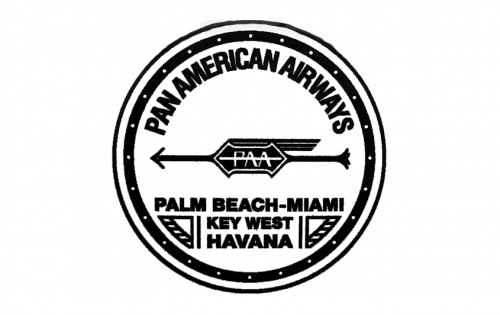
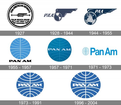
The very first logo was created for Pan American Airlines in 1927 and only stayed active for several months. It was a circular badge with lettering and delicate graphical, executed in a black and white color palette. The logo had a double outline, and the main inscription arched along the upper interior part of the framing. It was executed in a bold and slightly narrowed sans-serif typeface, above the thin Ali gated horizontally oriented arrow, pointing to the left. In the center of the arrow, there was a sharp black banner with the “PAA” abbreviation and a stylized wing on top. The west orientation of the arrow was complemented by the list of locations, set under it: “Palm Beach Miami, Key West, Havana” were written in the uppercase and enclosed between two stylized wings.
1928 – 1944
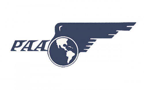
The redesign in 1928 introduced a new logo; which stayed with the famous air carrier for more than a decade. It was a smooth and solid blue and white badge, with the globe inscribed into an enlarged stylized wing, spread to the right, and a sleek “PAA” abbreviation in the same shade of blue, set on the left from the globe. The lettering was executed in a custom italicized typeface with its stable and bold letters decorated by sharp serifs, elongated and pointing to the right, standing for motion, speed and reflecting the purpose of the company and the field of its activity.
1944 – 1955
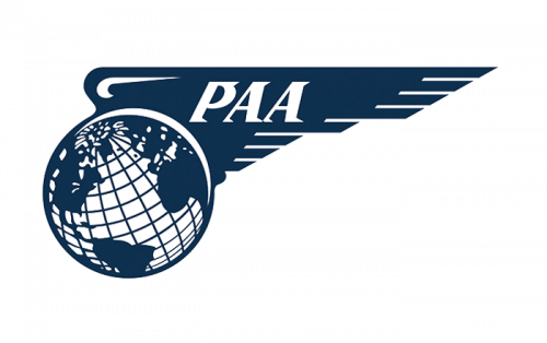
The winged logo was redesigned in 1944, keeping the original idea and color palette; though elevating both. The shade of blue became brighter and more intense, the globe was now more white than blue, got meridians and more details on it, and started looking more vivid and voluminous. As for the lettering, it was now set in white right on the wing and got its typeface refined as well. The massive sharp serifs became shorter and more delicate, which turned the overall look of the badge into a more modern and professional one.
1955 – 1957
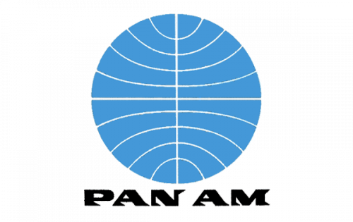
The era of the iconic circular badge we still can see today started for the company in 1955, with the introduction of the first blue sphere badge. It was a solid light blue circle with thin white arched meridians on it and one vertical line coming through the center of the badge. The “Pan Am” logotype was written under the emblem in bold black capitals, executed in a font, resembling the one from the previous versions, with sharp serifs. But the new typeface was more geometric and stable, with the clean triangular shapes on the bottom of the vertical bars of the letters.
1957 – 1971
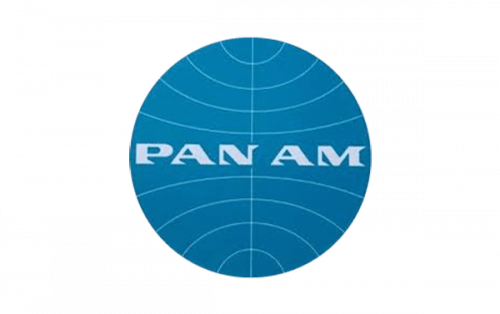
The redesign of 1957 moved the lettering to the center of the circle. The typeface remained untouched, but the color was changed from black to white, and the size of the letters got a bit smaller. As for the globe itself, it got its colors elevated too, with the new shade of blue replacing the bright sky shade. The white meridians became thinner and cleaner, and that gave a more elegant mood to the badge, adding professionalism and confidence.
1971 – 1973

The concept was changed in 1971, but it didn’t last long. The new badge was composed of the same elements, the globe, and the logotype, but placed and executed in different ways than the previous ones. The light blue contoured globe was now set on the left from the enlarged wordmark, written in the same shade of blue, using a very simple sans-serif typeface for its title case letters. It was simple, it was solid, and it did evoke a sense of reliability and trustworthiness.
1973 – 1991
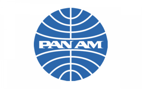
The iconic sharp logotype came back in 1973, being placed on a solid blue globe again. The color palette was elevated, with blue becoming calmer and chicer, and the white arched lines became bolder and more distinct, perfectly balancing the thickness and massiveness of the letters in the “Pan Am” wordmark. This is, definitely, the most recognizable Pan American Airlines logo ever created for the air carrier.
1996 – 2004
The Pan American World Airways logo featured the colors of the sky and clouds, blue and white. The curves created an illusion of motion. In the center of the design, there was the lettering “PAN AM” (the abbreviated name of the company) featuring an unusual type with sharp serifs. The emblem was placed inside a circle divided into two fields (equal in terms of their surfaces) by a vertical line.
Font and Color
The sharp and stable lettering from the last official logo of Pan American World Airways was set in a custom extra bold font with interesting triangular details on the ends of the bars. The closest typefaces to the one, used in this insignia, are, probably, Personalization Regular, or Vartek Semi Expanded Black, with significant modifications of the contours.
As for the color palette of the Pan American World Airlines visual identity, it was based on a combination of blue and white, the scheme, which is associated with sky and air, and at the same time, symbolizes reliability and trustworthiness.


