In the array of superhero logos there are those that represent hellish superheroes. One of them is devoted to Spawn.
Meaning and history
Fortunately, Spawn is just a fictional antihero created by Todd McFarlane. This character appears in the comic book “Spawn” published by Image Comics. Like any self-respecting superhero Spawn has a logo which has been around since 1992, the year when he made his first appearance.
1992
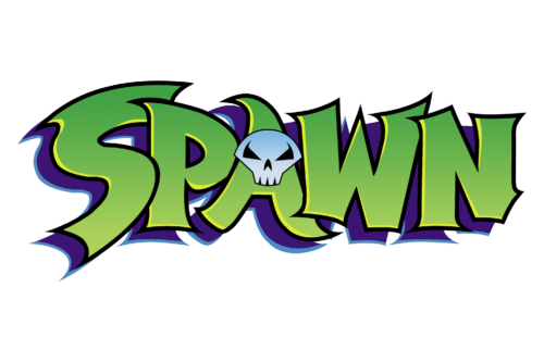
The Spawn logo is anything but friendly. It features the character’s name “SPAWN” in a 3-D design. A head of a horrible creature is emerging out of the letter “A”. The head looks like a human skull which is considered to be a symbol of death. We have no doubt that the superhero is scary.
More than that, Spawn’s wicked personality is excellently represented in the logo by font and color choices.
Font

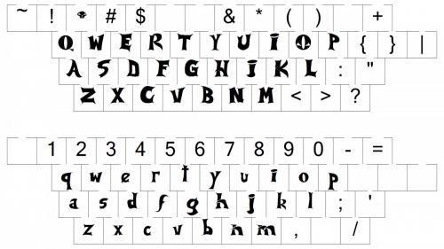
The font used for the logo is a specific font design that resembles a gothic typeface. The letters with uneven, “ragged” outlines look unfriendly and are a clear reference to the evil nature of the antihero. The 3-D appearance also adds to the sinister look of the logo.
Color
The Spawn logo usually comes in dark green color but there are also illustrations in black coupled with dark green. The dark color palette reinforces the negative impression of Spawn’s “bad-guy” character.
Emblem
Besides this wordmark-based logo there are also symbol-based logos. They are in the form of an emblem featuring the face of the superhero. Among them there is a Spawn emblem depicted against the background of an upside down triangular shape which usually represents strength. It is relevant because according to the book this fictional character alongside with multiple powers possesses superhuman strength, endurance and speed.
All the logos are simple and bold.


