 Tiger Aspect Productions Logo PNG
Tiger Aspect Productions, a prominent British television and film production company, is a subsidiary of Banijay. Founded in 1988, it was originally known as Tiger Television. The company, under its current name, has been operational since 1994.
Renowned for producing a diverse range of genres, including comedy, drama, and children’s programming, Tiger Aspect has contributed significantly to British television culture. Its operations extend across various regions, with a notable presence in the UK television industry. The company’s versatility and commitment to quality content have made it a key player in the media landscape.
Meaning and history
Peter Bennett-Jones founded Tiger Aspect Productions in 1988, initially named “Tiger Television,” which soon became a key entity in the entertainment sector. Celebrated for innovative shows like “Mr. Bean” and “Peaky Blinders,” the company has demonstrated its adaptability and artistic flair. “Mr. Bean,” with the incomparable Rowan Atkinson, crossed global boundaries, while “Peaky Blinders” delved into the gritty aftermath of WWI, amplifying Tiger Aspect’s narrative expertise.
Under the expansive Banijay banner, Tiger Aspect Productions flourishes, pushing boundaries and diversifying its artistic narrative. It stands as a beacon of innovation in the realm of media, continually redefining excellence with its bold storytelling and commitment to evolving the landscape of television and film.
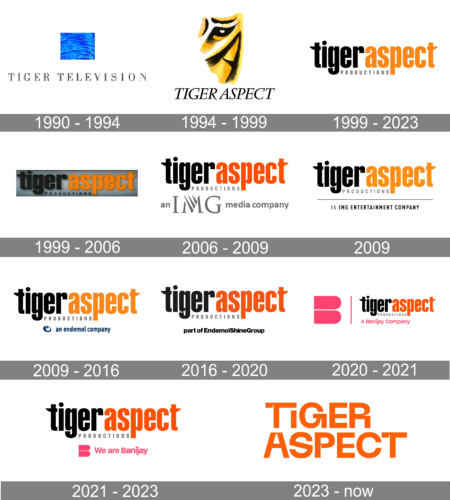
1990 – 1994
The insignia presented is a blend of typographic precision and symbolic imagery, representing ‘Tiger Television’. Emblazoned with an elegant serif typeface, it conveys the brand’s dignified and enduring nature. The word ‘TIGER’ is prominently showcased in a robust, emphatic font, drawing the observer’s gaze, while ‘TELEVISION’ is crafted in a more refined, yet no less stately manner beneath.
Hovering above the nomenclature is a singular, cerulean square, graced with a pattern that evokes the gentle undulations of a serene aquatic surface, possibly an emblematic nod to the ‘Tiger’ aspect of the moniker, reflecting the dynamic and immersive qualities of the television medium. The aquatic motif may represent the lucidity, profundity, and introspective qualities that are the hallmarks of compelling storytelling. This emblematic composition is both minimalistic and rich in connotation, portraying a brand steeped in tradition with an eye towards the horizons of creative and pioneering broadcast narratives.
1994 – 1999
At the heart of the logo is an artistic rendition of a tiger’s face, abstracted to highlight its defining features with bold brush strokes in black and shades of golden yellow. The tiger’s eye is particularly prominent, conveying a sense of focus and intensity.
Below the graphical element, the name “TIGER ASPECT” is spelled out in an elegant, serif font. The letters are black, creating a strong contrast against the softer background hues. The artistry of the tiger gives the logo a sense of motion and vitality, while the text grounds the design with a classic touch, suggesting a balance between dynamic creativity and established reliability.
1999 – 2023
The design is minimalist and modern, with the text in lowercase letters. The first word “tigeraspect” is presented in a bold, sans-serif typeface, with a gradient that transitions from black on the left to a vivid orange on the right, embodying the brand’s energy and creativity. The second word “productions” is positioned below, in a smaller, plain black font, serving as a straightforward descriptor. The blending of colors in the main word captures attention and may represent the blending of traditional media production with innovative storytelling, reflective of the company’s ethos.
1999 – 2006
This logo for ‘tigeraspect productions’ is a study in the harmony of contrast and dynamism. The name ‘tigeraspect’ is split into two color themes; ‘tiger’ is enshrouded in an elegant gradient of grayscale, symbolizing a classic, timeless approach, while ‘aspect’ is infused with a vibrant, fiery orange, suggesting innovation and a burst of energy.
The split in color not only attracts the eye but also hints at the dual nature of the company’s ethos—rooted in tradition yet always pushing the boundaries. The word ‘productions’, set off to the side in a smaller, understated grey font, complements the larger, bolder company name. This logo encapsulates the essence of ‘tigeraspect productions’—a company with a solid foundation in the media industry and an ever-burning passion for creating groundbreaking content.m
2006 – 2009
In this creative design, the term “tigeraspect” is artistically rendered in a striking blend of orange and black hues, emphasizing its lowercase lettering for a distinctive appeal. Positioned beneath this, the inscription “IMG media company” subtly indicates the affiliation of Tiger Aspect as a subordinate entity to the overarching IMG corporation.
This layout not only captures the essence of Tiger Aspect’s identity but also visually represents its corporate linkage with IMG, fostering a sense of unity and corporate identity. The choice of colors symbolizes energy and boldness, aligning with the tiger theme, while the lowercase typography adds a modern, approachable touch to the brand’s image.
The strategic placement of the IMG reference beneath reinforces the hierarchical business relationship, yet does so in a manner that maintains the primary focus on the Tiger Aspect brand, showcasing its unique character within the larger IMG framework. This design choice embodies a seamless blend of artistic expression and corporate branding, conveying a message of both independence and alliance within the business world.
2009
The emblem portrays “tigeraspect productions” in a stylized, streamlined font, evoking a sense of sleek sophistication. The name ‘tigeraspect’ is a fusion of ebony and tangerine tones, with ‘tiger’ inked in a deep, resonant black and ‘aspect’ in a vibrant, zesty orange, symbolizing a blend of strength and innovation. Below it, the word ‘productions’ is subtly crafted in smaller black letters, offering a contrast in scale yet unifying in color. Completing the logo’s narrative is the tagline “AN IMG ENTERTAINMENT COMPANY,” cleanly etched below, signifying its strategic alliance with the IMG conglomerate.
2009 – 2016
In the presented logo, ‘tigeraspect’ is artistically rendered with a sophisticated flair, where ‘tiger’ is adorned in a commanding shade of jet, symbolizing a foundation of strength and depth. In contrast, ‘aspect’ is bathed in a luminous orange, echoing the brand’s essence of vibrancy and creative spark.
The term ‘productions’ lies beneath in a discreet, yet assertive black, grounding the brand’s identity in the realm of media creation. Completing the tableau is ‘an endemol company’, encased within a sapphire-hued emblem, which serves as a cool visual anchor and a nod to Tiger Aspect’s affiliation with the eminent Endemol enterprise.
2016 – 2020
Crafted with an eye for contrast and brand identity, the logo displayed here for ‘tigeraspect productions’ marries stark black with an exuberant orange, echoing the duality of elegance and vitality inherent to the brand. The ‘tiger’ portion, etched in authoritative black, evokes the animal’s classic stripes, while ‘aspect’ is illuminated in an orange reminiscent of a tiger’s fiery gaze, suggesting a fusion of traditional strength with contemporary zest.
‘Productions’ is inscribed below in a subtle, yet dignified font, anchoring the name with industry gravitas. Emblazoned beneath is the declaration ‘part of EndemolShineGroup’, in a straightforward script, signifying the production company’s alliance with the media powerhouse.
2020 – 2021
In the wake of Banijay’s acquisition of Endemol, there was a significant alteration to the established insignia. The year 2020 marked the introduction of a fresh emblem and accompanying tagline from Banijay, symbolizing a new chapter in the corporate narrative. This visual modification signified integration and a forward-moving direction under the Banijay banner.
The updated emblem now incorporates the distinctive Banijay symbol, which is emblematic of the conglomerate’s expansive reach and influence in the media sector. Additionally, a newly crafted byline has been added, encapsulating the ethos and the strategic vision that Banijay foresees for its new subsidiary.
2021 – 2023
The visual signature displayed presents ‘tigeraspect’ in an arresting typographic design, where ‘tiger’ is cast in a robust onyx, and ‘aspect’ stands out in an incandescent orange, mirroring the fierce and spirited essence of the brand’s moniker. Beneath this, the word ‘productions’ is inscribed in a more subdued, yet equally authoritative black script. A declaration of alliance and identity is made with a pop of pink bearing ‘We are Banijay’, affirming Tiger Aspect’s place within the Banijay family.
2023 – Today
The logo is typographic, consisting of two words: “TIGER” on top and “ASPECT” below it. Both words share the same vibrant orange hue, which stands out with a bold presence. The font is modern and sans-serif, characterized by clean lines and even spacing. Notably, the letters are capitalized, adding to the visual impact of the design. The color choice of orange is often associated with creativity and enthusiasm, aligning with the company’s dynamic approach to media production.


